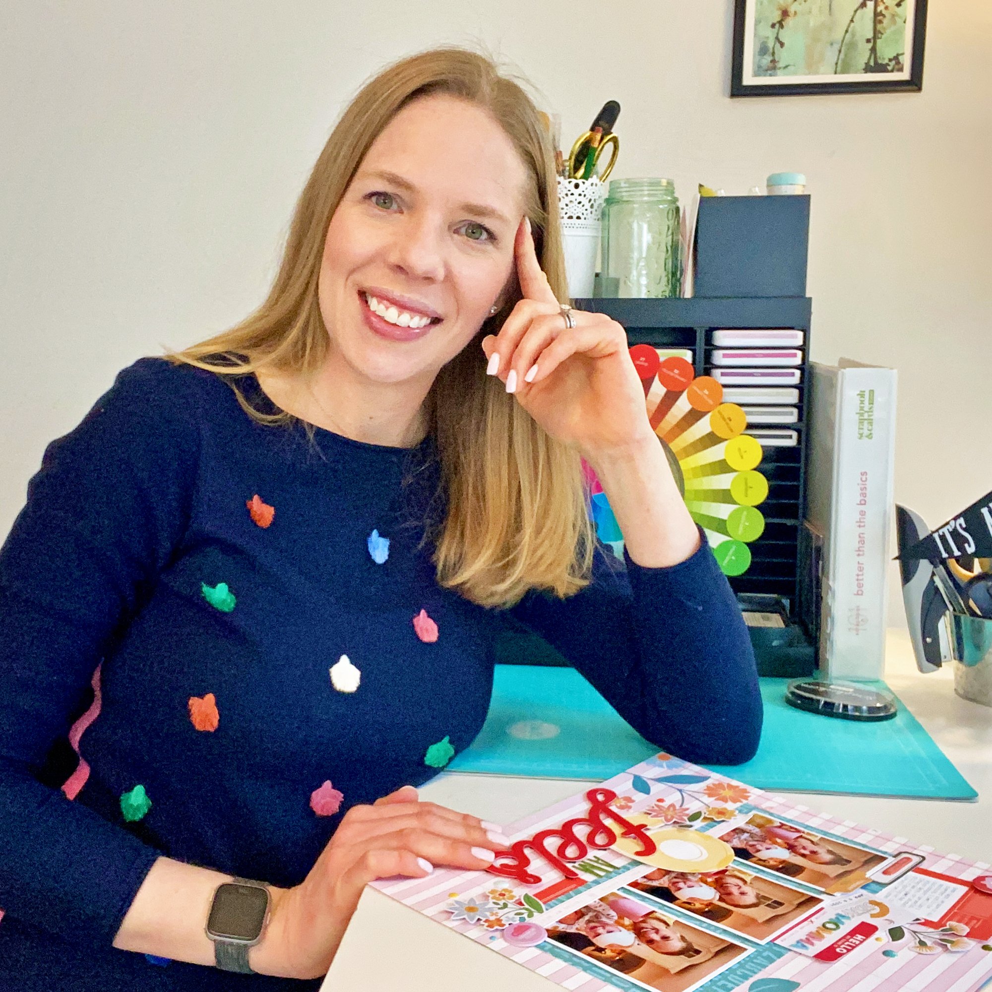
SCT Magazine Summer Issue: Salcombe Pocket Page
/Last summer, we spent a lovely few days exploring the lovely little seaside villages of Devon, and I was taken by one in particular: Salcombe. When I received the Fancy Pants Bright Side collection* to work with for my Pocket Play column in the summer issue of Scrapbook and Cards Today Magazine, I knew that the photos that I took in this colorful and happy place would be the perfect fit.

Supplies | Bright Side collection pack, 6" x 6" paper pack, chipboard stickers, tags and labels; Elle's Studio Mini Dated stamp, All the Details stamp, Family Fun stamp
By sticking with a single collection, it was an easy job to put this double pocket page spread together!

I wanted to make the title, or the name of the village really stand out on my page, so I cut the alphas out with my Silhouette machine, using my favorite sans-serif font, Bebas Neue. I cut them twice, first with patterned paper from the Bright Side 6" x 6" paper pack, then from gray cardstock, so that they would have a shadow and stand out more. These were bookended with the pretty "Natural Beauty" floral pattern, also found in the paper pack. I also added a thin strip of red washi tape across all of the title pockets to draw your eye to the "highlights" chipboard sticker on the right.

Around my central title, I added the colorful photos that I took during our trip, all with a thin, white border. This helped to keep the page bright and light. Each photo was topped with a journaling spot from the tags and labels pack, which I added my typed journaling to. I also filled in any negative spaces in my photo with small embellishments, like the "life is sweet" chipboard sticker here. What better phrase could there be for an ice cream photo, right?
Because the little labels weren't enough, I added more extensive documentation by using larger journaling spots in the tags and labels pack, with the Rough Typewriter font. Since they were smaller than my pocket, I simply adhered them to 4" x 4" squares of patterned paper from the 6" x 6" paper pack! I also added some stamped phrases around my layout, like the "happiness found" one here from the Elle's Studio All the Details stamp. The pretty pinwheel and flowers found in the ephemera pack from the Bright Side collection pack were perfect for adding to the left side of my journaling.

Thanks so much for checking out this new pocket page spread! Be sure to read my Pocket Play column in the summer issue of Scrapbook and Cards Today Magazine, where I'm sharing my tips and tricks for easy and beautiful pocket pages!

You can find all of the awesome product that I used on this spread via the clickable gallery links below. Thanks for your support!
*Clicking these links will take you to the Scrapbook.com shop, and when you purchase, I receive a small percentage of the sale. It doesn't cost you any extra, so thanks so much for your support!