
Layered Carnations with Gina K. Designs
/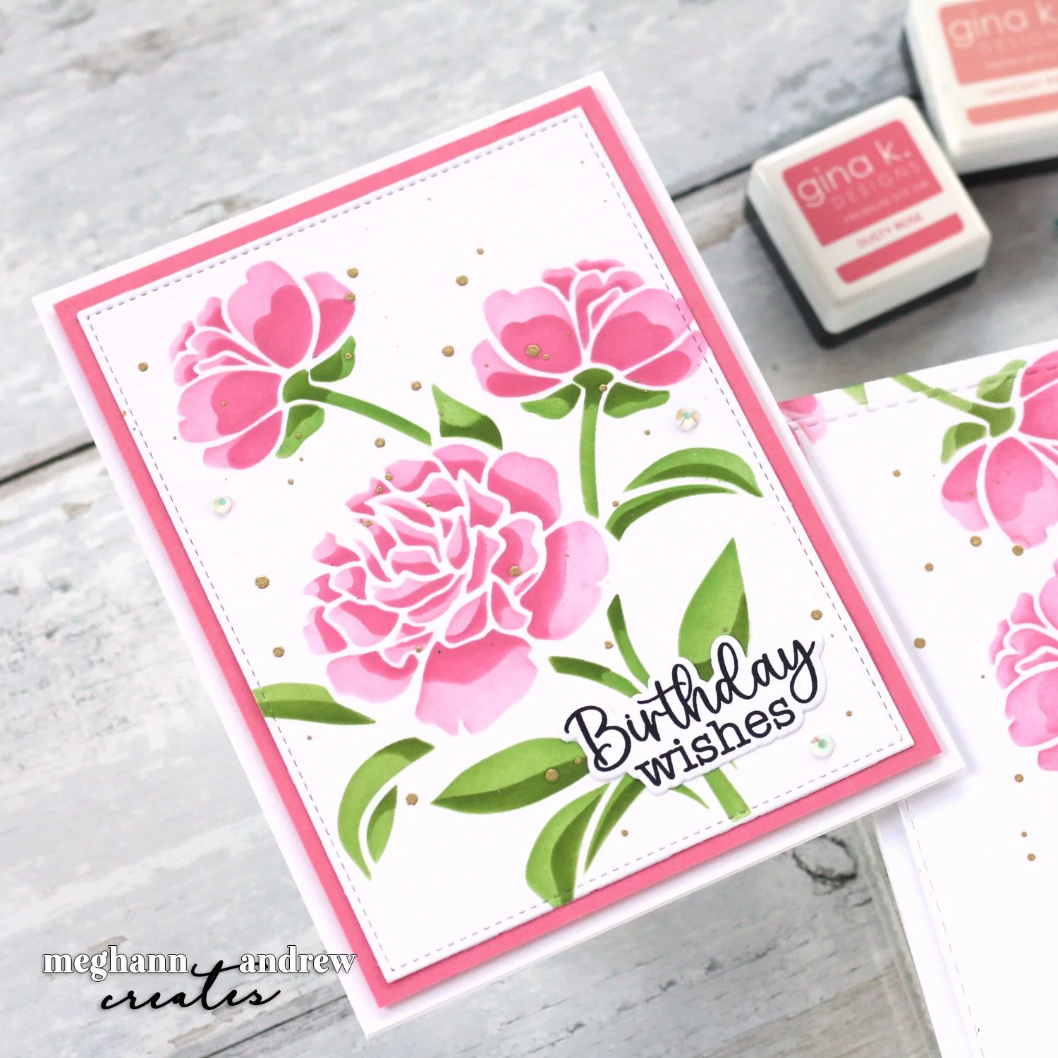
See the cards that Meghann created using the Layered Carnation stencil set from Gina K. Designs!
Read MoreSee the cards that Meghann created using the Layered Carnation stencil set from Gina K. Designs!
Read MoreJoin Meghann as she creates mini shaker Valentines in a rainbow of fun, conversation hearts!
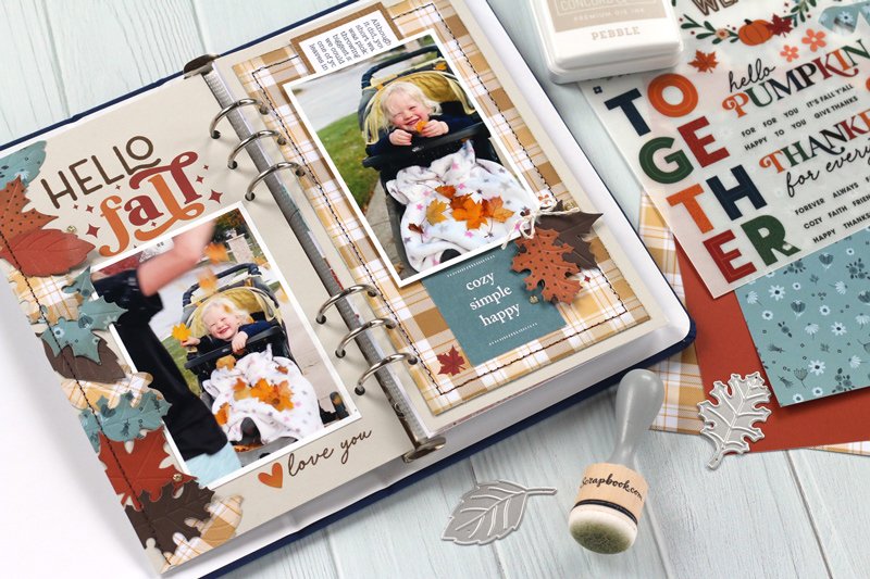
Read MoreHello, friends! I’m so glad you joined me today! I just had a new project to share over at the Scrapbook & Cards Today blog, and I wanted to share it with you here, too! Fall is my favorite season, and I am in love with this new, seasonal traveler’s notebook spread that I created with the latest Scrapbook.com exclusive products. Take a look!
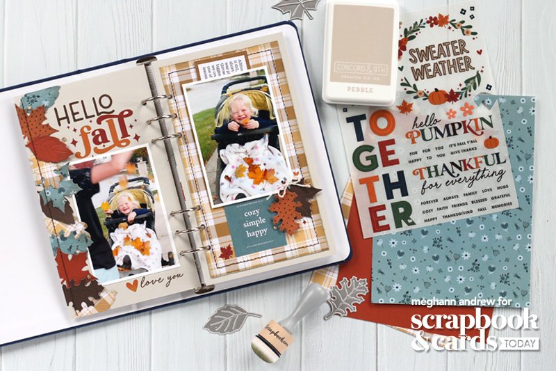
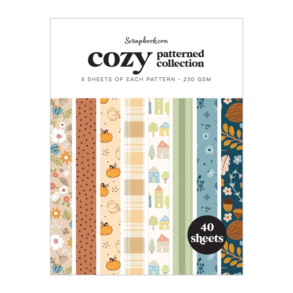
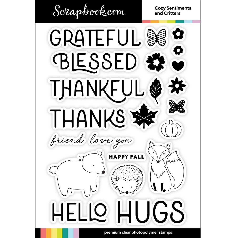
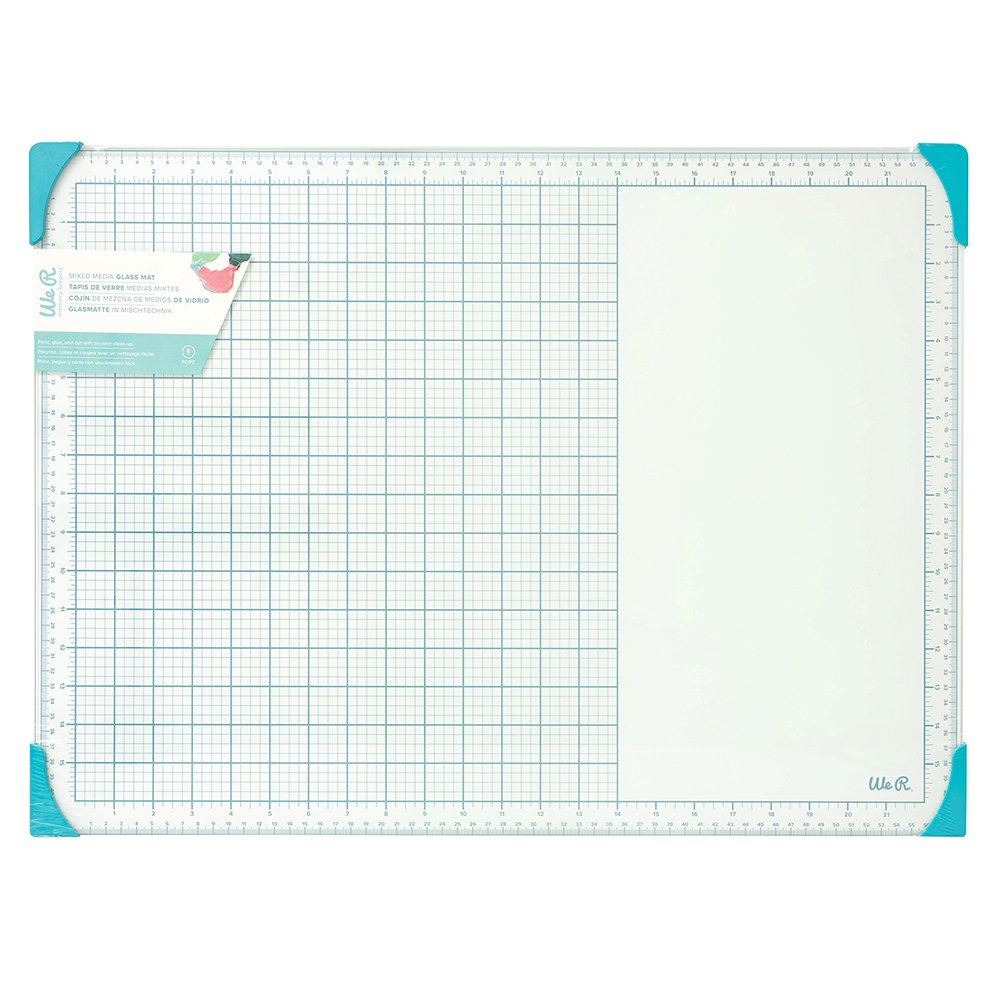
Supplies | Scrapbook.com: Cozy patterned paper 6×8 pad, Cozy Autumn Foliage shape dies, Cozy Autumn Sentiments & Critters stamp, Cozy Autumn rub-on transfers, Rose Quartz Misti, Magic Mat, ink blending tool, Deluxe adhesive roller, Mint tape – 1-inch roll, small precision scissors; Concord & 9th: Ink (Pebble, Nutmeg), Pebble cardstock; LDRS Creative: Rose Quartz Stampendable tool; Spellbinders: Platinum 6 die-cutting machine; American Crafts: Bungalow Lane embellishment die-cuts; WeR Makers: glass mat; Citrus Twist Kits: traveler’s notebook; Font: American Typewriter; Other: sewing machine, thread
This layout was so fun to create, not to mention easy, using the new, exclusive products from Scrapbook.com. From patterned paper to must-have rub-ons, these products made this spread come together in no time!
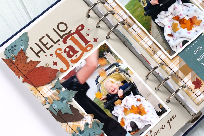
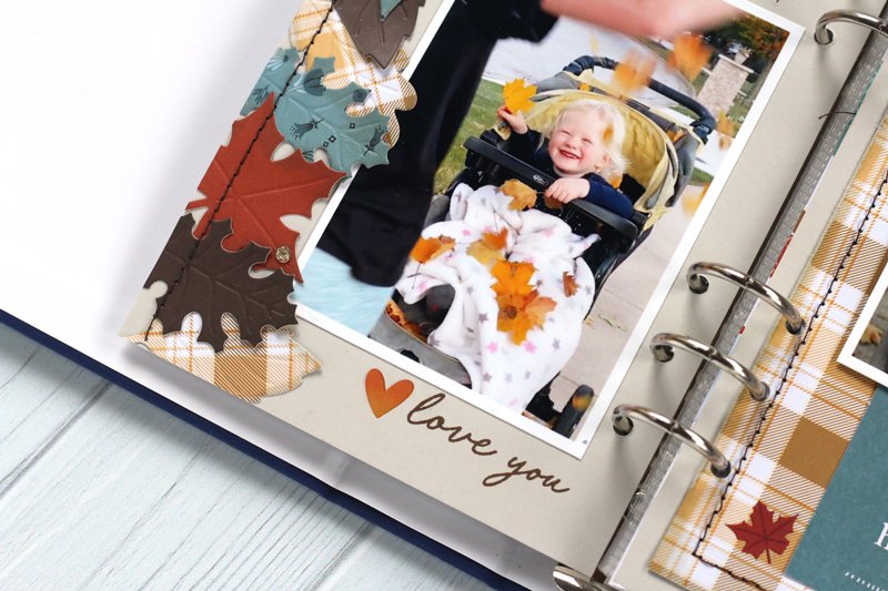
The left side of my spread is full of texture & interest with the column of leaves on the edge, created using the Cozy patterned paper 6×8 pad and Cozy Autumn Foliage shape dies. I loved the beautiful patterns and colors in the paper pad, which even includes solids! I also loved the special touch that the dies deboss the veins on the leaves and cut them at the same time!
The Cozy Autumn Sentiments & Critters stamp helped me create my title with the “hello” word and this sweet “love you” below. To finish my title, I paired this stamp with the Cozy Autumn rub-on transfers to add the sparkly “fall” word and a few small leaves and hearts around the spread.
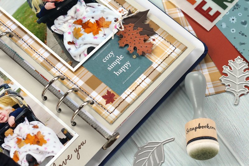
On the right side of the spread, I had to use the beautiful plaid pattern from the Cozy patterned paper 6×8 pad, adding stitching around the edge for texture. I added two die cut leaves to the corner of my photo and was so happy to use two pieces from the American Crafts Bungalow Lane embellishment pack, which coordinated beautifully with the Scrapbook.com products. It feels great to use something from my stash at the same time as creating with new products!
Ready to see more of this project? Watch my process video, featured on the Scrapbook & Cards Today YouTube channel below!
I hope you enjoyed seeing this project come together as much as I did creating it! Be sure to follow me on Instagram so that you can see more projects using Scrapbook.com exclusives, and be sure to shop what I used to create this project at the affiliate links below and above in my supply list. Thanks so much for your support, and happy creating this fall!

Hey there, friends! It has been a while since I have stopped by this space of mine, and I think it is about time that we become reacquainted! I have missed blogging, and want to make it a goal to add updates here regularly in 2023.
Today I want to talk to you about being published! I know that as papercrafters, this is often a goal. I’m here to tell you that your goal is attainable and give you some tips for checking off that bucket-list item!
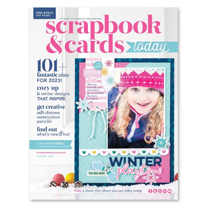
I was so fortunate to be published on the cover of the Scrapbook & Cards Today Winter 2022 issue! If you haven’t yet checked out this publication, I highly recommend you do, and it’s FREE!
When I was assigned the task to create a cover layout, did I run out and purchase the latest collections to work with? Nope. I looked around my stash and grabbed what I had on hand. What makes a pub-worthy project? Good design! Let me break that down for you:

Color matters: When I begin my layout, 95% of the time I choose a color scheme that ties into my photo. This will make your photo POP and helps it to become the focus of the page. On this layout, I chose the darkest color, navy, to frame my page, then filled in the background with the accent colors from the photo, pink and teal.
Think contrast! Bold designs are what will draw your eye to the project on the pages of a magazine, so think about how you can use contrasting colors, shapes, textures, patterns and fonts.

Titles are terrific! Layout titles are a great way to add contrast and interest and make your layout stand out. Use only 2-3 different fonts and colors and choose contrasting fonts like I did here!

Don’t go overboard with embellishment. A clean design is often best on a magazine page, so when choosing your embellishment, select wisely. Be sure to think about contrast in shape and texture, and always take off one item before you call it done. Just like Coco Chanel said, “Before you leave the house, look in the mirror and take one thing off.” Do the same with your layouts!

Use lines. Last, but certainly not least, think about how lines play a role into how you look at your layout. Borders, frames and other implied lines created by embellishment or the way you cut patterned paper can all create interest and draw your eye to the photo on your page. Use lines to your advantage!
I hope you’ll use these tips when creating for a magazine submission, and great news: the Scrapbook & Cards Today Summer issue call is now available!
Have you heard of the SCT Sampler? It is a specially curated package of papercrafting goodness from your favorite companies delivered right to your doorstep each month! The SCT Sampler is not a kit in the traditional sense—it’s bite-sized! A hand-picked selection of new products in mini quantities offering you an opportunity to make a beautiful new discovery. Sample the newest designer trends AND have a surprise delivered to your door every month, and you must have a subscription to get it!
Take a look at what I got in my Sampler this month:

New products from Doodlebug Design, Pink Paislee, an embossing folder from Close to My Heart and an exclusive acrylic word created by SCT! The colors are beautiful, and they all work together so perfectly! Take a look at the new 8-1/2” x 11” layout that I created:

The paper that I loved most in the kit was the colorful diamond pattern from the Pink Paislee Bloom Street collection, and I started by fussy-cutting it, adding it to a white cardstock background and sewing down the center of the diamonds to add texture! This paper set my color scheme for the page. Next, I took the Bloom Street pink patterned paper and ran it through my embossing machine using the Close to My Heart embossing folder, adding some subtle texture. This created the matte for my 4” x 6” photo.

The Sampler card includes a really lovely quote each month, and I decided to do something fun with it! I layered the exclusive acrylic word on top of the card, then used colorful thread to stitch it in place. This added dimension and fun detail! After layering my photo on top of the card, I started embellishing with the fun die-cuts and stickers included in the Sampler.

I continued adding the diamond shapes across the page by fussy-cutting three more diamonds, adhering them to the background, then stitching them down. Next, I created a cluster of embellishment at the bottom right corner of my photo using a the Doodlebug Love Notes collection patterned paper strip and die cuts. I love the floral elements included—with all of the other hard lines going on on this page, they broke those lines up a bit.

A large butterfly die cut, a few heart die cuts and stickers, and a few drops of dark blue ink finished off this page, all about how much my daughter loves her daddy!

Even thought you can no longer receive this month’s Sampler, don’t miss out on the opportunity to start your subscription as soon as possible with April’s Sampler! Sign up for your subscription today for as little as $13, and find your next favorite product in an SCT Sampler!
Thanks for stopping by and happy creating!
Over the summer, I attended the RISE conference with Rachel Hollis, a life-changing motivational conference featuring speakers that help to put you in the mindset to conquer anything you want to change in your life! I attended with Catherine Tachdijan of Scrapbook and Cards Today, and we had a wonderful weekend of friendship, food and the powerful conference that helped set my soul on fire. I highly encourage attending this conference if you feel like something is missing from you life. I wanted to document my favorite photos and thoughts from this weekend, and I did that in a pocket page that I created while at Crop & Create Cornwall, to share with my make-and-take attendees! I wanted to show them that you can have just as much fun in pockets as you can on a scrapbook layout, and get so much more documented! I’d love to share this special page with you today:

Supplies* | Project Life Stories Value Core Kit, Color Kaleidoscope puffy stickers, Color Kaleidoscope sticker book, Color Kaleidoscope washi tape set, Mini Dated stamp
Created with only a few products (which are all on sale at my links—the Project Life core kit is 50% off!), this pocket page came together so easily because the core kit coordinated beautifully with the Color Kaleidoscope collection from American Crafts and Vicki Boutin. My favorite pocket was the title pocket, which was originally black and white, and I colored in with watercolors to coordinate with the three main colors of my color scheme.
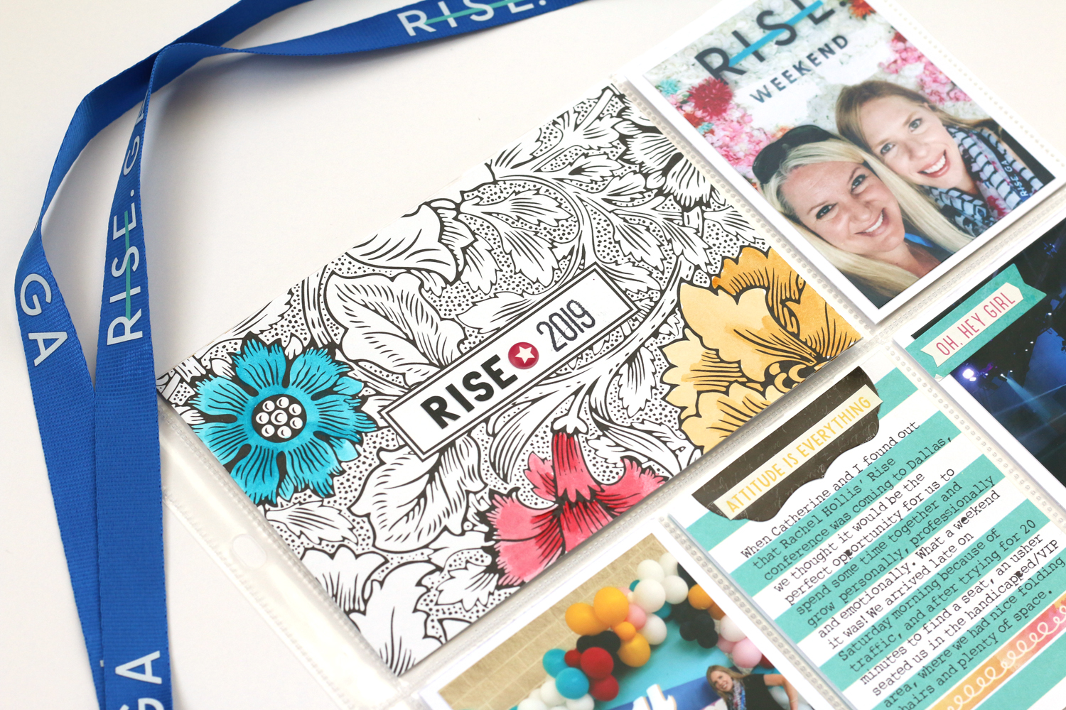
The color scheme was easily to come up with—I simply matched the colors of the conference materials! The pocket cards worked perfectly for me to add journaling and minimal embellishments—like washi tape, cardstock stickers and tiny puffy stickers!

I kept the back of the pocket page fun and bright, adding small bits of embellishment and two filler pockets for visual interest! I love the bright and bold pops of color from both my products and photos!

The “I love this story” card was one of my favorites in the kit, and I had to use it right in the center of the page. My favorite 4” x 6” photo of Catherine and I from the weekend, taken on the “made for more” wall, was divided across two 3” x 4” pockets. I added no embellishment to it—you don’t have to embellish each and every pocket!

If you love these products as much as I do, be sure to head to the links below to grab them at great discounts!
If you’re interested in learning how to document in pockets or already do so, but want to take your pocket pages to the next level, check out my self-paced, year-long class with Scrapbook & Cards Today, Inside the Pocket! Each month contains a PDF lesson on a specific topic related to pocket page design, releasing on the 2nd Monday of the month. Then, on the 4th Monday of the month, one of our talented contributors shares their inspiration and their tips with you! As a class attendee, you’ll also receive access to a special Facebook Group, where we share our projects and ideas. I’d love for you to join me in Inside the Pocket! Thanks so much for stopping by, and happy creating!

*Clicking these links will take you to the Scrapbook.com and Elle's Studio shops, and when you purchase, I receive a small percentage of the sale. It doesn't cost you any extra, it’s just a way to say “thanks for inspiring me!”

Hello and thanks for coming by my blog today! SCT Magazine creates the best kits, and the summer SCT Delivered kits, which include the Summer Dreams scrapbook kit, Make a Wish card kit are now available in the shop! Not only do you receive a kit packed full of product from your favorite manufacturers, you will also receive an exclusive stamp, cut files and printables, as well as full-color instructions for each of the design team projects created using the kit! Buying this kit is a great way to get your layouts created quickly and beautifully!
I was able to work with the Summer Dreams scrapbook kit, and I’m excited to share my layouts and card with you today, as well as a special discount! First, let’s start with my double-page spread:

This fun page took its color scheme from the multi-colored stripe paper on the left and includes three 4” x 6” and two 4” x 4” photos. To keep your eye moving across the spread, I added the fun cardstock, patterned paper, die cut and tag circles, which add the fun!

My favorite part is this multi-product title that I created using the exclusive digital die cuts, exclusive stamp and small puffy alphabet stickers. To add more color, I stamped “ beach love” above in several colors.

The exclusive printables here: the painted yellow tag, “memories” tab, and sweet bikini tag created the perfect group of embellishments and journaling here at the top right corner. I loved creating this fun layout about an awesome day with family and friends at the beach!

How about a sweet and simple card? Layering patterned paper and stitching it together provided some texture on this card. Exclusives in the kit—the “sun” stamp and sparkly “shine” foam word, along with the pink “hello” die cut created the greeting. To amp up the cuteness factor, the bee die cut finished off the card! I love cards that can be used for any occasion, and this is certainly one of them!

My final layout, a 12” x 12” single page layout, started off with product: the cockatoo card! I knew I had a photo of my daughter in Hawaii holding a white cockatoo, so I printed two 3” x 4” photos and got to work! I decided to go for a BOLD, floral, tropical feel on this page, and I cut the colorful ray paper on the background, leaving only the colors I wanted to show on this page, and backed it with the dark blue pattern. From there, it was all about layering!

Layers of cardstock, patterned paper, printable tag, die cuts and fussy-cut flowers surround my photos, where the colorful rays draw your eye. I love the exclusive stamp so much, and I used it to stamp “vacation memories” on the rays at the bottom left corner, where I also added the date of our trip.

My title was fussy-cut with the “hello” patterned paper card, and the “sunshine” exclusive digital die cut word. I love the sweet memory that this page records, and especially when product helps me remember a memory that would have otherwise been forgotten.
Now for your special discount! Purchase either the Summer Dreams scrapbook kit or the Make a Wish card kit today and receive a 10% discount, using the code
Don’t miss out on these beautiful kits, available only while supplies last! Thanks so much for stopping by, and happy summer creating!
Last summer, we spent a lovely few days exploring the lovely little seaside villages of Devon, and I was taken by one in particular: Salcombe. When I received the Fancy Pants Bright Side collection* to work with for my Pocket Play column in the summer issue of Scrapbook and Cards Today Magazine, I knew that the photos that I took in this colorful and happy place would be the perfect fit.

Supplies | Bright Side collection pack, 6" x 6" paper pack, chipboard stickers, tags and labels; Elle's Studio Mini Dated stamp, All the Details stamp, Family Fun stamp
By sticking with a single collection, it was an easy job to put this double pocket page spread together!

I wanted to make the title, or the name of the village really stand out on my page, so I cut the alphas out with my Silhouette machine, using my favorite sans-serif font, Bebas Neue. I cut them twice, first with patterned paper from the Bright Side 6" x 6" paper pack, then from gray cardstock, so that they would have a shadow and stand out more. These were bookended with the pretty "Natural Beauty" floral pattern, also found in the paper pack. I also added a thin strip of red washi tape across all of the title pockets to draw your eye to the "highlights" chipboard sticker on the right.

Around my central title, I added the colorful photos that I took during our trip, all with a thin, white border. This helped to keep the page bright and light. Each photo was topped with a journaling spot from the tags and labels pack, which I added my typed journaling to. I also filled in any negative spaces in my photo with small embellishments, like the "life is sweet" chipboard sticker here. What better phrase could there be for an ice cream photo, right?
Because the little labels weren't enough, I added more extensive documentation by using larger journaling spots in the tags and labels pack, with the Rough Typewriter font. Since they were smaller than my pocket, I simply adhered them to 4" x 4" squares of patterned paper from the 6" x 6" paper pack! I also added some stamped phrases around my layout, like the "happiness found" one here from the Elle's Studio All the Details stamp. The pretty pinwheel and flowers found in the ephemera pack from the Bright Side collection pack were perfect for adding to the left side of my journaling.

Thanks so much for checking out this new pocket page spread! Be sure to read my Pocket Play column in the summer issue of Scrapbook and Cards Today Magazine, where I'm sharing my tips and tricks for easy and beautiful pocket pages!

You can find all of the awesome product that I used on this spread via the clickable gallery links below. Thanks for your support!
*Clicking these links will take you to the Scrapbook.com shop, and when you purchase, I receive a small percentage of the sale. It doesn't cost you any extra, so thanks so much for your support!
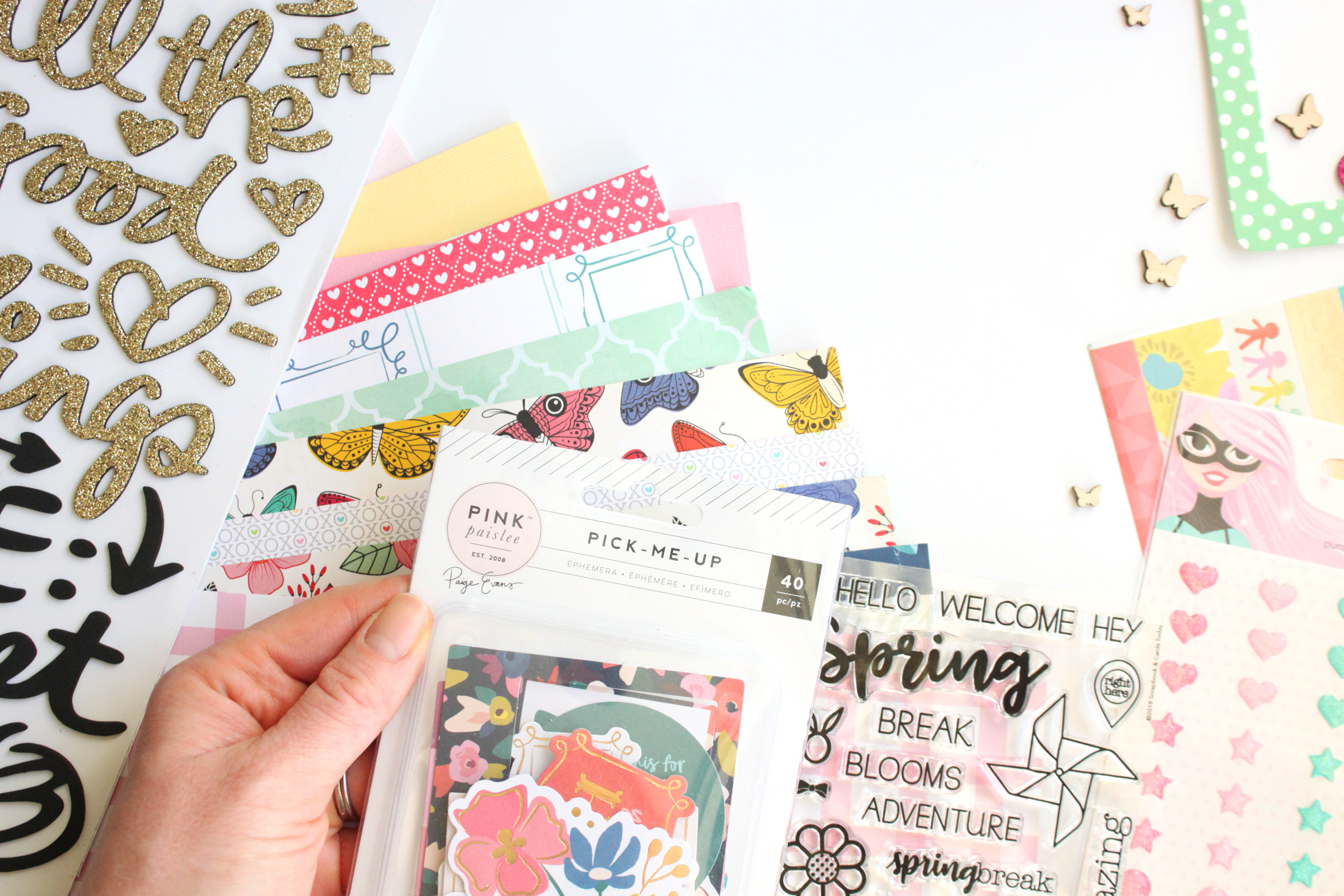
Hello there! I am so excited to share one of my favorite layouts created so far this year, using the beautiful Blue Skies and Butterflies Kit from Scrapbook and Cards Today Magazine. If you've never purchased one of their kits before, you're in for a treat! They include the latest products from the industry, along with beautiful exclusives, plus a well-designed, useful stamp! I created a few projects with the kit, and as a bonus, instructions on how to create them can be found in a full-color download when you purchase the kit.
This was my favorite creation using the kit—a 12" x 12" layout documenting a favorite photo of my little girl.

I have held on to this photo for AGES, as I loved it so much, and didn't have the "perfect" products to go along with it. That all went out the window when my Blue Skies and Butterflies Kit arrived! I wanted the layout to be playful and a bit haphazard, but colorful and fun, just like my little girl.

Do you see those adorable little pinwheels? They are from the exclusive stamp, which I stamped onto patterned paper from the kit! I love all of the beautiful colors included in this kit—from spring to fall, they will work with any season you want to scrap!
I also did a bit of fussy-cutting on this layout. Those lovely American Crafts All the Good Things butterflies and Pink Paislee Pick Me Up frame just needed to be cut out and added to this page. I even used the frame to add a tiny bit of journaling, along with the date of the photo.

Another exclusive download that you will receive when you purchase the kit is a sheet of large tags—great for journaling or adding to your page for embellishment, like I did with the black and white gingham tag here. I simply cut a banner notch at the bottom to hang it from the base of my heavily-layered photo mat.
Those tiny little bows (included on the exclusive stamp in the kit) stamped around my page added the perfect girly touch and tiny elements that I love to add around embellishment groupings.

You know, I'm not a massive fan of sparkle, but the Heidi Swapp frame and "shine on" glitter Thickers from the All the Good Things collection included in this kit added just the perfect touch to this layout, and made my photo the focus of all of the lovely layers included on this page. Plus, the glitter on them does not come off—a must for this glitter-phobic girl!

I really loved working with this kit! Stay tuned to see more projects that I created using it, and be sure to grab one of the Blue Skies and Butterflies Kits while supplies last! Happy creating!
I was so excited when we received our assignments for the Scrapbook and Cards Today winter issue because we were to document something that we loved. Well, aside from my family, my next love is travel! I love going new places, eating new foods and taking in the culture wherever I go. It was only natural that this is what I decided to document for the issue.
So, I sat down to create my layout, and made a single 12" x 12" layout.

I loved my layout, and was so happy with how it turned out. It wasn't until I went to send it to the editor for review, when I saw that I had the assignment wrong... it was supposed to be a 12" x 12" double page spread! After my initial moment of panic wore off, I decided to take a deep breath and challenge myself to making this the right side of a double page spread, and what I created ended up being one of my favorite layouts from 2017, using the Escape the Ordinary collection from Pinkfresh Studio. (*All product links contained in this post are affiliate links. You don't pay any extra, but I get a small percentage of your sale! Thanks for your continued support of my YouTube feed and this blog!)

Supplies | Pinkfresh Studio Escape the Ordinary collection at Scrapbook.com: Explore Patterned Paper, Dare Patterned Paper, Wander Patterned Paper, Fabric Die Cut Pieces, Leatherette Alpha Stickers, Layered Tags, Clear Acrylic Stamp; at Simon Says Stamp: Puffy Stickers, Ephemera Die Cuts, Chipboard Stickers

My challenge, after I created a single-page layout that I loved, was to create a complementary page to that layout, and I feel like I did just that with the left side of the spread. You can see how I created my initial page, including how I used the print and cut method on my Silhouette Cameo to add a circular photo to my layout, as well as the decisions I made when I made this a double-page spread instead of a single page, on the following process video:
Thank you so much for stopping by! I hope this video has shown you that there are no "accidents" in crafting—only opportunities for more creativity! Happy creating!
If you receive the Scrapbook and Cards Today weekly newsletter to your email, you may have noticed a little sneak of the layout that I'm about to share. (If you don't receive the newsletter, why not? It's easy to sign up for here, at the very bottom of the page.) This layout was featured in the 3Ts section of the fall issue (available for free here!) and is all about repetition! (*All product links are affiliate links. You don't pay any extra, but I get a small percentage of your sale! Thanks for your continued support!)

Supplies | (all from the Maggie Holmes Carousel Collection from Crate Paper and ON SALE!) Marquee Patterned Paper, Sweets Patterned Paper, Dazzle Patterned Paper, Festival Patterned Paper, Ephemera with Glitter Accents, Cardstock Stickers, Chipboard Stickers, Clear Stickers, Gold Foil Thickers, Clips
Since this layout was all about repetition, I began with my photos! With a 4 year-old, it's necessary to take at least 5 photos at a time because: A) they're not looking, B) they talk and C) they're not looking! Ha! So I generally have several photos that I end of deleting. On this layout, I used all of the photos— the one where my daughter wasn't looking, but I could see her sweet profile, the one where she is doing the "scrunchy face" and the great photo. They're similar enough to be like a "repeat" across the page. I added interest to the top of the photo mat with a flower, tag and button from the Ephemera with Glitter Accents pack.

Next, I wanted to add repetition in my journaling! To separate the great photo on the right, I repeated small, rectangular journaling spots cut from the Festival Patterned Paper, down the length of my photos, mixing it up a bit with the colors and patterns. I topped this journaling off with my title, which I created using Cardstock Stickers and Gold Foil Thickers.

To add some balance to the left side of my journaling stack, I grouped the other half of the beautiful black and white flower and camera from the Ephemera with Glitter Accents pack with the bow from the Chipboard Stickers at the bottom of my journaling. I loved that feminine touch it added. The "happy little moments" sticker was from the Clear Stickers and I added it to a piece of white cardstock before adding it to my page.

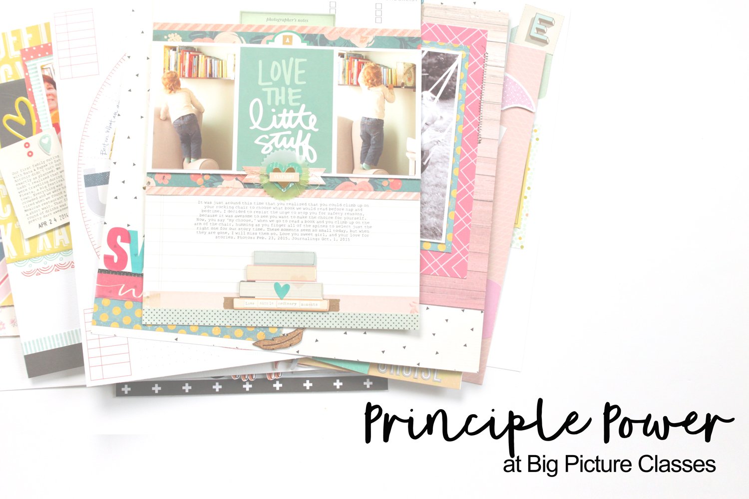
Repetition is a technique that I love using on my pages, and it just so happens to be one of the topics that I discuss in my class at Big Picture Classes, Principle Power! I'd love for you to check it out and learn how to use repetition in your layout designs!
Be sure to shop the Crate Paper Carousel collection while it is still on sale, via the links in the supplies above, or the gallery below. Thanks for stopping by and happy creating!
In the latest issue of Scrapbook and Cards Today magazine, I created a double-page layout that I just love, using the new Fancy Pants Dream Big collection, and I'm sharing it with you today! This layout documents an amazing hike that I took with my brother last fall in the Daniel Boone National Forest in Kentucky. I'm loving creating double-page layouts lately, and it's a design challenge for me to tie the two pages together in a successful way! (*All product links are affiliate links. You don't pay any extra, but I get a small percentage of your sale! Thanks for your continued support!)
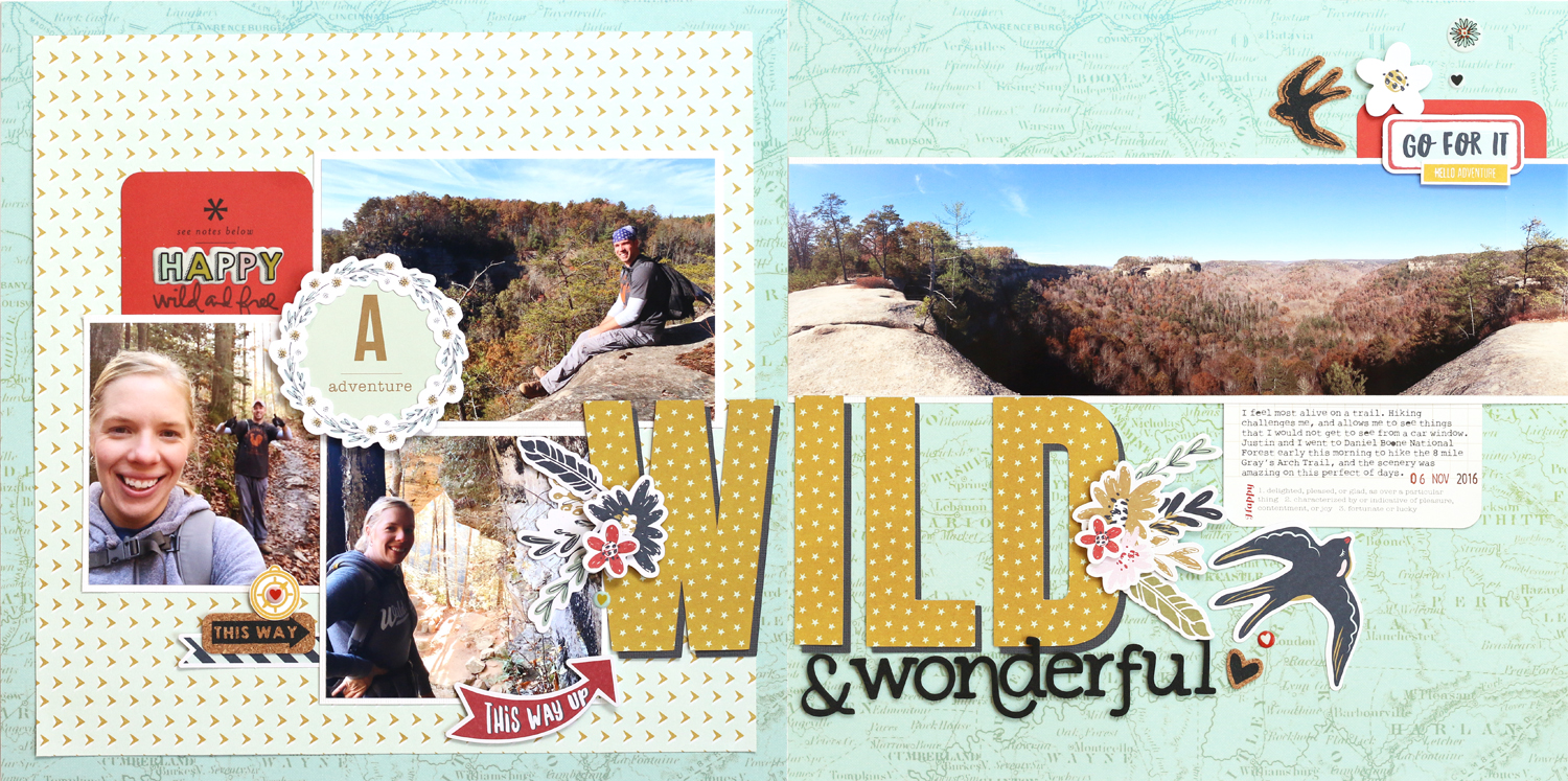
Supplies | Fancy Pants Dream Big Collection Kit, Fancy Pants Dream Big Cork Stickers, Fancy Pants Dream Big Collection Puffy Stickers, Becky Higgins Everyday Edition Core Kit, Ali Edwards "Wild" Story Stamp
The coolest part about this layout happened when I first started creating. I glanced at the map paper background, and realized that I recognized the names of the towns. It turns out that on our day of hiking, we were just south of where this map print ended at the base of the page! What a coincidence!
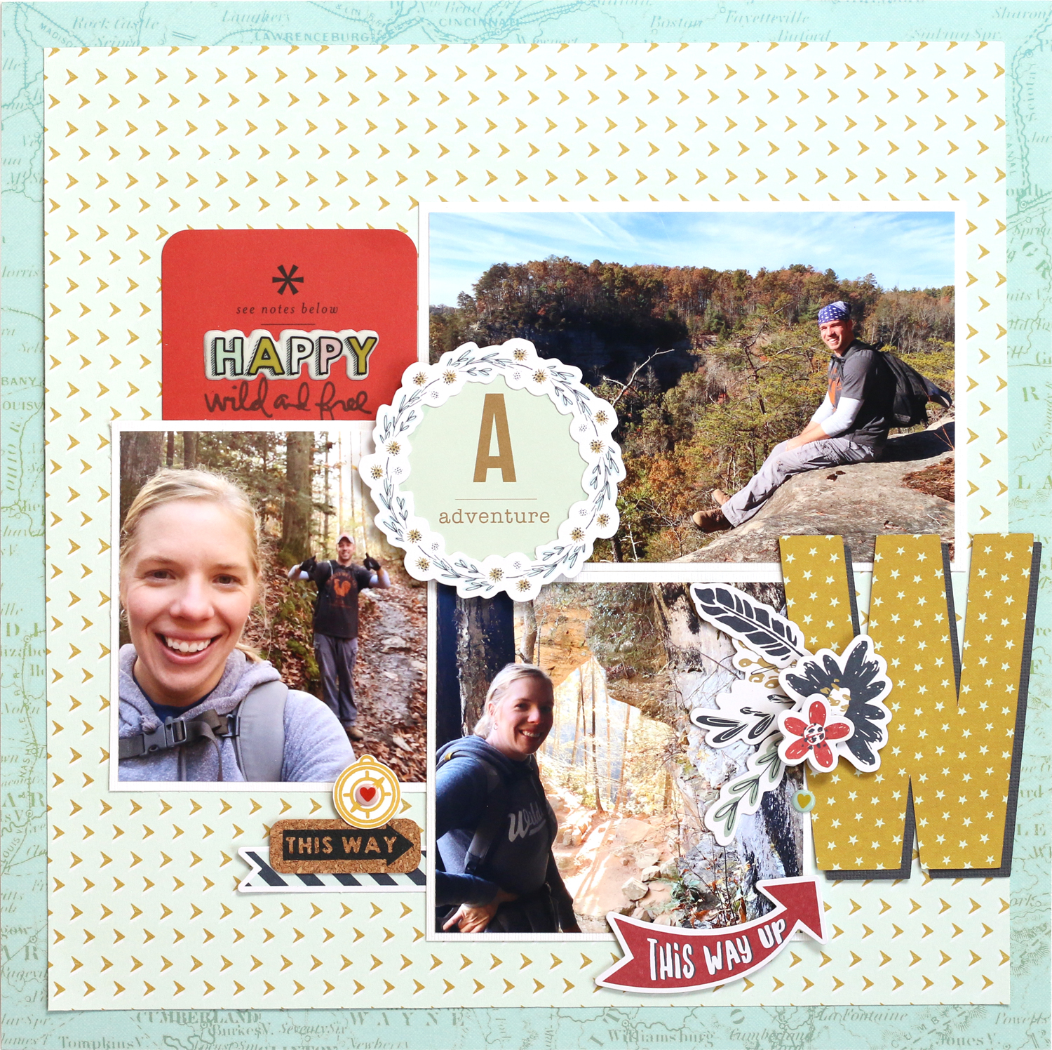
I started out with my left page, including one 4" x 6" photo and two 4" x 4" photos, overlapped in the center. To cover up that gap, I added a Project Life Everyday Edition "Adventure" card that I punched into a circle, then topped with one of the Dream Big collection die-cut wreaths.
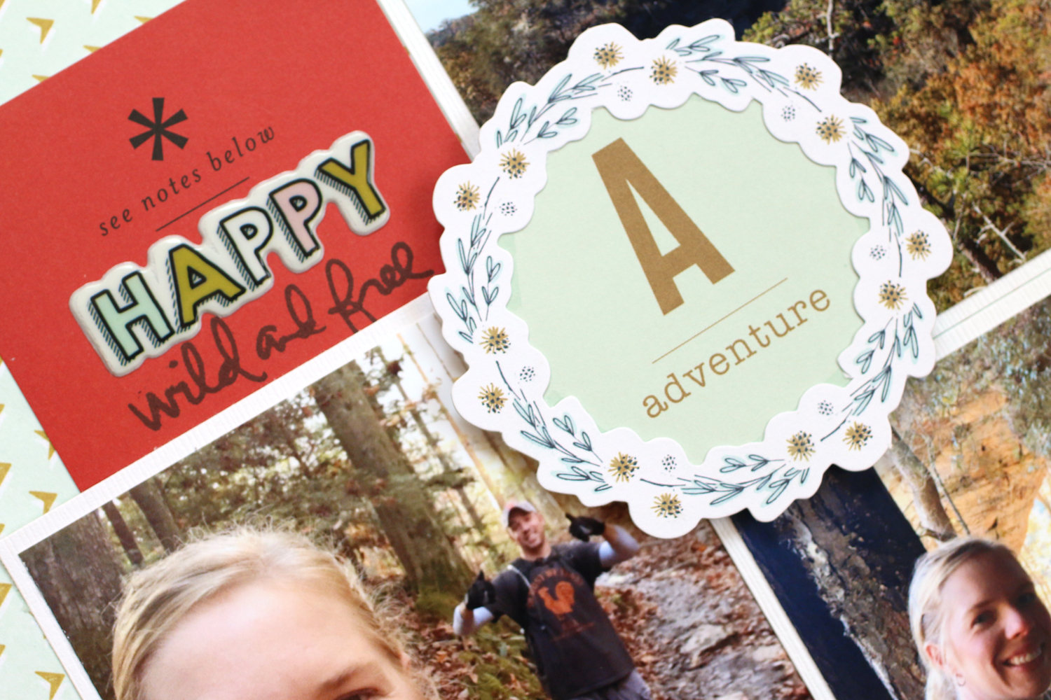
Above it, I tucked a red Becky Higgins Everyday Edition Core Kit behind my photo, and added a puffy sticker from the Dream Big Collection Kit, and stamped with the "wild and free" phrase from Ali Edwards. On this side, I also started my title, which I cut from Dream Big patterned paper with my Silhouette Cameo using one of my favorite title fonts, Bebas Neue. I also cut the same size letters out in dark gray cardstock, creating a shadow on the title.

I continued my title to the right side of my spread, just below my 4" x 12" photo. Here's a little trick for you: I don't have a printer that will print a 12" wide photo, so to get this panoramic image, which I took with my iPhone, I opened the JPG in Photoshop Elements and cropped the image to 4" x 12". I then added a guide line at the 11" wide mark on the ruler and cropped to 4" x 11" before printing that out on an 8-1/2" x 11" page. Then I hit "undo" and cropped the last 1" x 4" portion of my photo, on the right side of the guide line before printing that small piece onto a 4" x 6" sheet of photo paper. Once I trimmed that tiny section, I adhered both to a white photo mat that was 4-1/4" x 12" before adhering that to my layout. You can barely see where the two pieces of the photo meet!

To each side of my title, I added a beautiful spray of flowers and leaves using the gorgeous Dream Big die-cuts, included in the Dream Big Collection Kit. This was my favorite part of the layout!

My journaling was typed using the Rough Typewriter font and printed on a Becky Higgins Everyday Edition Core Kit journaling card, which couldn't have been more perfect for what I wanted to say about this day.

My last area of embellishment just above my photo on the right side includes the bottom of the Becky Higgins Everyday Edition Core Kit red card from the left side of my layout, which completed the red visual triangle across my spread, with the red arrow being the middle of the triangle. (To learn more about visual triangles, check out my class, Terrific Titles, at Big Picture Classes! You can find that link on the sidebar. >>>) I also added the Fancy Pants Dream Big Cork Stickers and Puffy Stickers, along with an Ali Edwards stamp and a couple of die-cut from the Dream Big Collection Kit.
I SO love how this layout turned out, and I love that it documents a really amazing day even more. Be sure to check out all of the awesome Fancy Pants products I used on this layout in the gallery below:
A bit of pretty paper, food indulgences and a blessed life.
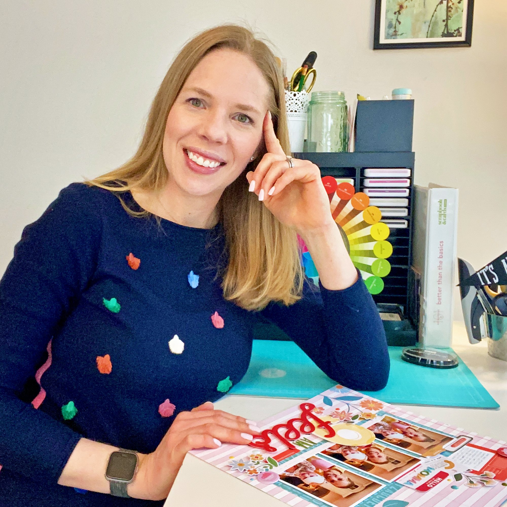
I'm Meghann Andrew, a wife, mother of two living in the Chicago suburbs, maker, and excess coffee drinker. Thanks for stopping by this space where I share a bit of my life and my creations.


A note from Meghann:
This is a for-profit blog. I use affiliate links for shops and products that I use, love and believe in on the sidebars and in posts, as well as on my other social media sites that are linked from here. If you purchase a product through an affiliate link, I receive a small commission, but you will pay no extra than if you had not clicked through my affiliate link. I receive product free of charge from manufacturers that I design for, which you can see above. All words and opinions expressed on this blog are my own.
All images copyright Meghann Andrew, unless otherwise noted. All rights reserved. Powered by Squarespace