How to Get Published in 2023!

Hey there, friends! It has been a while since I have stopped by this space of mine, and I think it is about time that we become reacquainted! I have missed blogging, and want to make it a goal to add updates here regularly in 2023.

Today I want to talk to you about being published! I know that as papercrafters, this is often a goal. I’m here to tell you that your goal is attainable and give you some tips for checking off that bucket-list item!

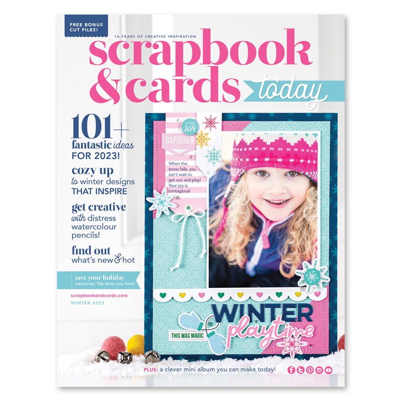
I was so fortunate to be published on the cover of the Scrapbook & Cards Today Winter 2022 issue! If you haven’t yet checked out this publication, I highly recommend you do, and it’s FREE!

Click HERE to download the Winter 2022 Issue today!

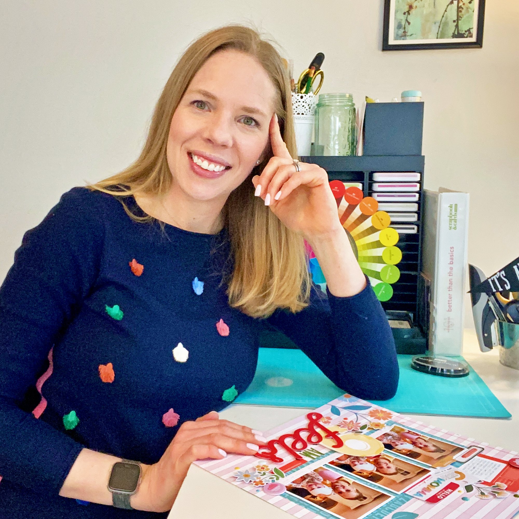
When I was assigned the task to create a cover layout, did I run out and purchase the latest collections to work with? Nope. I looked around my stash and grabbed what I had on hand. What makes a pub-worthy project? Good design! Let me break that down for you:

  • Color matters: When I begin my layout, 95% of the time I choose a color scheme that ties into my photo. This will make your photo POP and helps it to become the focus of the page. On this layout, I chose the darkest color, navy, to frame my page, then filled in the background with the accent colors from the photo, pink and teal.

  • Think contrast! Bold designs are what will draw your eye to the project on the pages of a magazine, so think about how you can use contrasting colors, shapes, textures, patterns and fonts.

  • Titles are terrific! Layout titles are a great way to add contrast and interest and make your layout stand out. Use only 2-3 different fonts and colors and choose contrasting fonts like I did here!

  • Don’t go overboard with embellishment. A clean design is often best on a magazine page, so when choosing your embellishment, select wisely. Be sure to think about contrast in shape and texture, and always take off one item before you call it done. Just like Coco Chanel said, “Before you leave the house, look in the mirror and take one thing off.” Do the same with your layouts!

  • Use lines. Last, but certainly not least, think about how lines play a role into how you look at your layout. Borders, frames and other implied lines created by embellishment or the way you cut patterned paper can all create interest and draw your eye to the photo on your page. Use lines to your advantage!

I hope you’ll use these tips when creating for a magazine submission, and great news: the Scrapbook & Cards Today Summer issue call is now available!

Click HERE to find the summer call and plan your submission today!

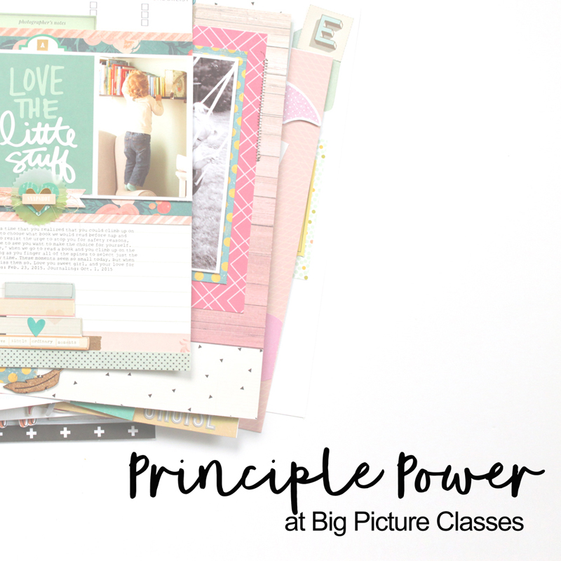
Find the current products that I used to create this layout by clicking the images below:

Two Ways with the Remember the Magic Collection from Echo Park Paper

Hello friends, and happy Friday! I recently had the pleasure of creating with the Echo Park Paper Remember the Magic collection for the winter 2020 issue of Scrapbook & Cards Today Magazine! Because Disneyland is just about my favorite place to be, this layout came pretty easily to me, using this very themed, beautiful collection to document Christmas Disney moments:

One thing I love about this collection? The addition of kraft as a neutral with the characteristic red, black, robin’s egg blue and golden yellow hues. The one piece of paper that made this layout “click” for me was this one:

This Tickets Please paper was just calling to be fussy-cut, and I created a fun column of tickets and ribbon from my stash (because who doesn’t love a good stash-bust!?) on the right side of my layout.

Lots of dimension and texture right there! I love everything about this layout—from the vertical design, to the images I chose, and the title I created from a mix of the Remember the Magic dies and stickers from Elle’s Studio and American Crafts.

FIND THIS LAYOUT IN THE WINTER ISSUE OF SCT MAGAZINE ON PAGE 43 AND 47!

Once I created the page, I put this collection away, expecting to create another Disney layout with it.

Then, I started thinking… why can’t I use this collection for something other than Disney memories? So, I challenged myself to do just that, on my first layout of 2021, created for the Scrapbook & Cards Today blog:

SCT-Magazine-Meghann-Andrew-2021-Crafty-Goals-01.jpg

Does this layout scream, “Disney!” to you? Nope! How did I take such a themed collection and stretch my stash to create a non-themed layout? Here are 3 simple tips on how to do it:

1: “Neutral” patterns & “B” side bonanza:

I was inspired by Paige Evan’s cut file (download for free at the SCT blog post!) to add a lot of stars to my page, and although the Wish Upon A Star paper shown on the left of my page may have included the Disney-friendly hues from the collection, once you took the Disney photos away, no one could tell the difference! I call this a “neutral” pattern. It can be used for anything, and you often find these in themed collections, too. This paper was the starting point for my color scheme, based on the collection. You can also see that I used patterned paper to fill in my “2021 Goals” die cut. All of these patterns are on the B-side of the paper, often the less-noticed, more low-key prints. Stripes, dots, plaids and geometrics are my preferred patterns, and they worked perfectly at the top of my page.

SCT-Magazine-Meghann-Andrew-2021-Crafty-Goals-04.jpg

2. Embellish Away the Theme!

Sure, this Remember the Magic collection has plenty of castles, big white gloves, and churros (mmmm…) in it, but I chose to ignore them. Instead, I searched the collections chipboard and sticker sheets for non-themed embellishments, like the “here we go” puffy arrow, “dreams admit one” puffy ticket and chipboard camera. Plus, there were plenty of chipboard stars to accent these larger embellishments. Every themed collection will have VERY themed embellishments, but ignore those and go for the ones that fit your page. The “dreams admit one” ticket was very notable on this layout about my goals for 2021, and the “here we go” arrow was perfect for documenting this at the very beginning of the year.

3. Mix and Match to Success!

Once I had the elements chosen from Remember the Magic, I shopped my stash for products from other manufacturers that would fit the design, hues and the story I wanted to tell. I grabbed that “crafty” chipboard piece from the Simple Stories Crafty Girl collection, as well as the amazing acetate stars from Elle’s Studio, which fit with the color scheme and the starry page I was going for! To finish off the page, I used the My Star Stamp from Elle’s Studio to add uplifting phrases around my embellishments. Starting with a themed collection to create a non-themed layout doesn’t mean you have to stick to those products only! Branch out and see what other items you may have on hand that would accent it!

I hope these tips have given you some thought as to how to bust your stash of themed collections for non-themed layouts! If you’re a Disney fanatic like me, be sure to check out the beautiful Remember the Magic collection for yourself, but don’t just use it for Disney layouts! Happy creating, friends, and have a beautiful weekend!