
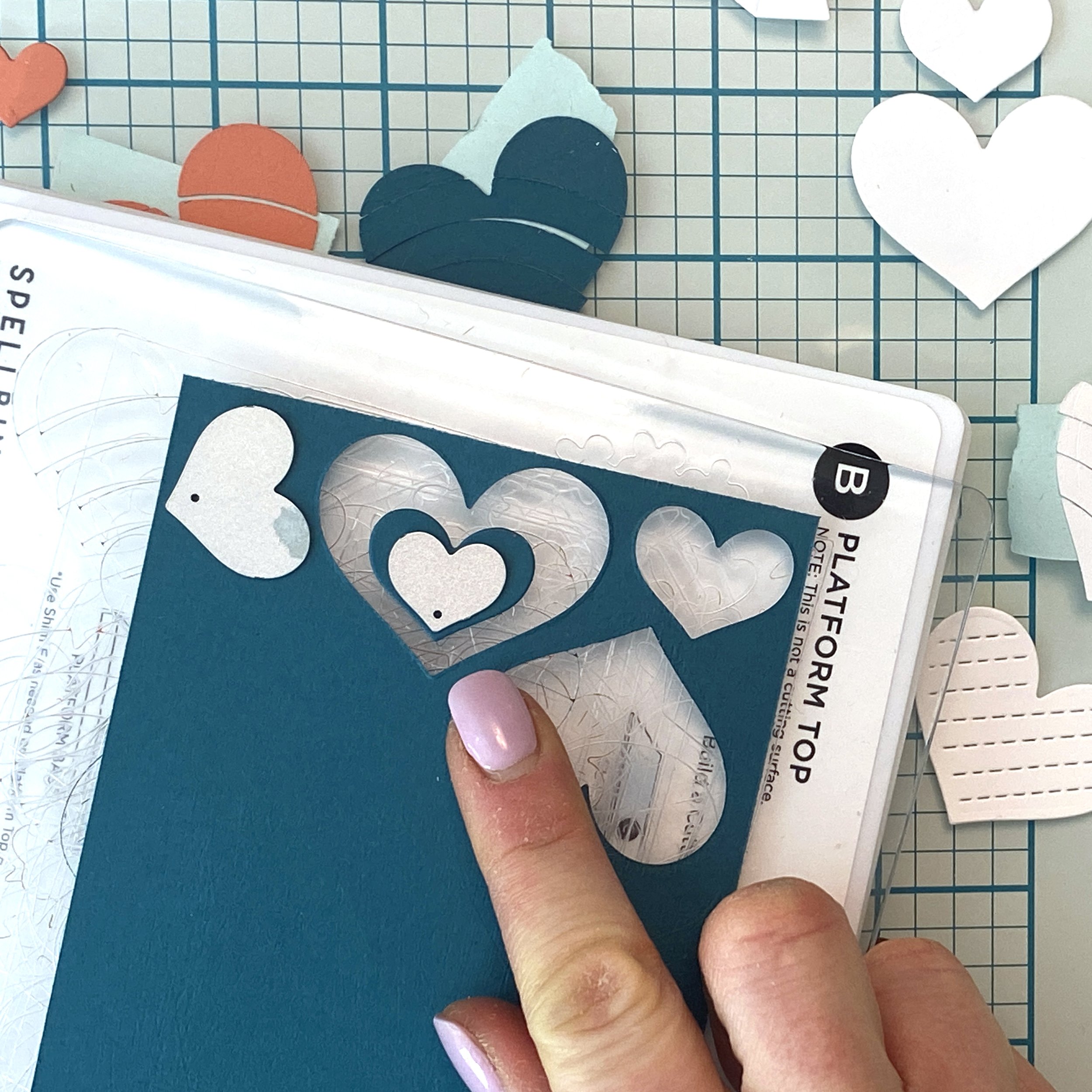
Spellbinders Advent Calendars Are Here!
/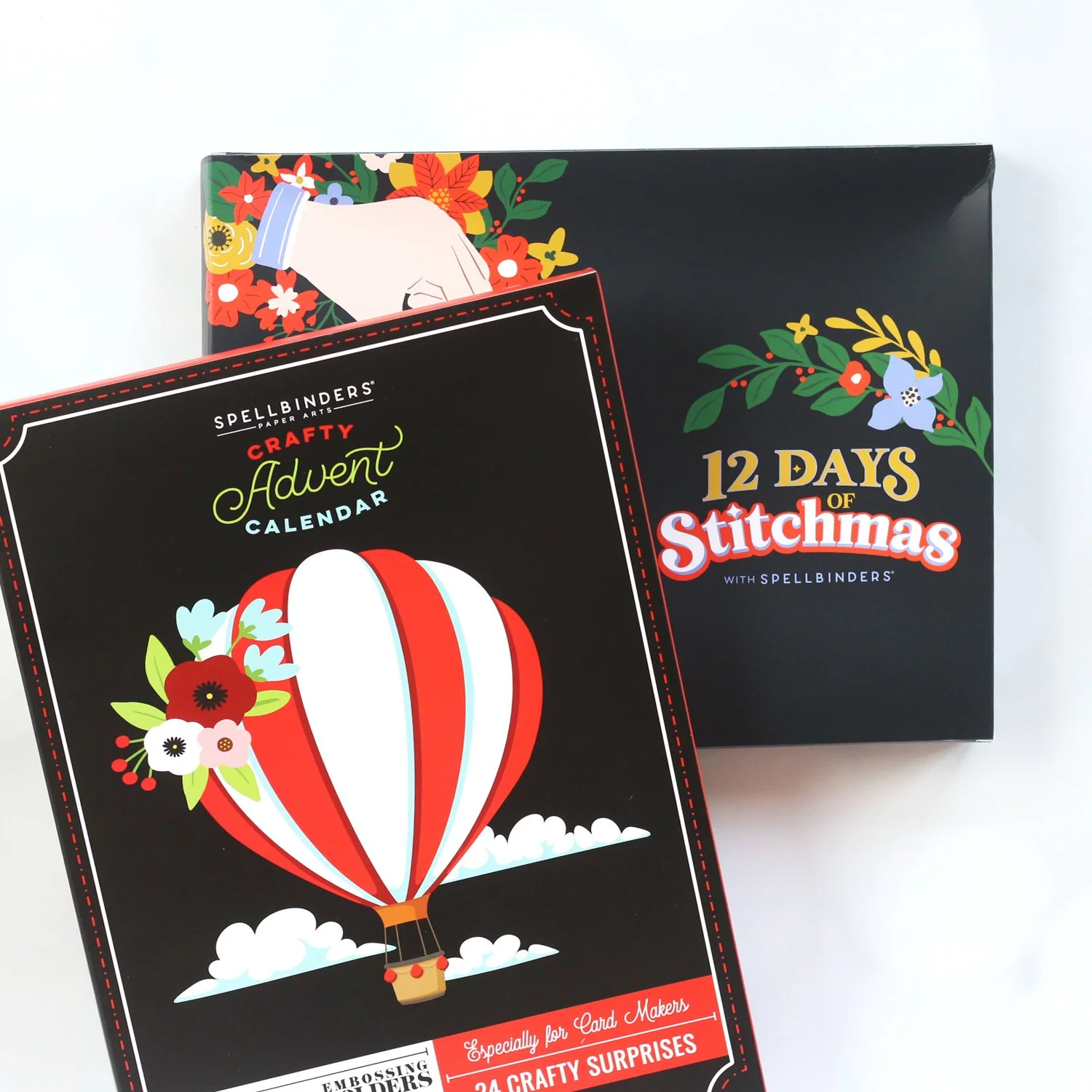
Check out the NEW Advent Calendars available from Spellbinders and craft along with Meghann this holiday season!
Read MoreCheck out the NEW Advent Calendars available from Spellbinders and craft along with Meghann this holiday season!
Read MoreJoin Meghann as she shares one of her most favorite products for cardmaking, and her favorite club kit from Spellbinders!
Watch Meghann create a textured background featuring the latest products from Gina K. Designs in this post & process video!
Read MoreJoin Meghann as she shares her first card created with the August 2024 Club Kits from Spellbinders!
Read MoreJoin Meghann as she creates a trio of birthday cards created with a fun bundle from Ranger Ink and colored with OLO Markers!
Read MoreLearn more about the July 2024 Club Kits from Spellbinders and see what I created using them!
Read MoreI am so excited to join my friends at Concord & 9th this summer for Summer Camp 2024!

This two-day cardmaking event is going to be so much fun! The weekend will be filled with inspiration, exclusive products and fresh ideas from my fellow camp counselors taught in 6 wonderful classes:

I will be sharing my love of Turnabouts with you, an I cannot wait! This weekend will be filled with color inspiration from the recent 2024 Color Collection release. If you haven’t yet seen the new Concord & 9th colors, check out this video where I show them off!
Take a look at what you’ll get when you register for this amazing event:

Are you ready to join me? Registration is open NOW and you’ll get a discount for registering early!
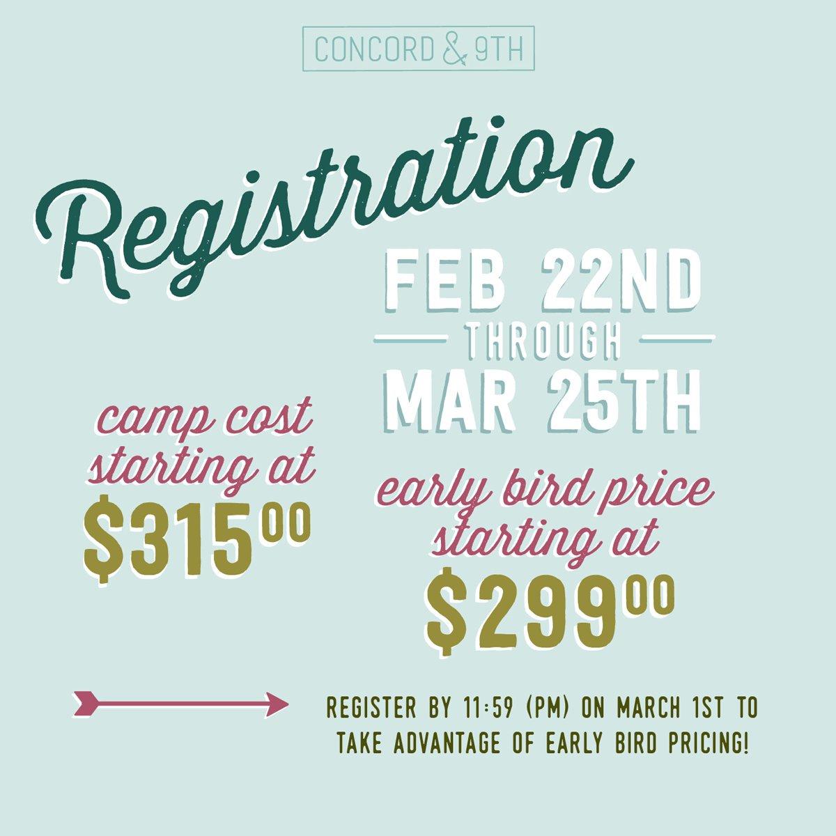
Let’s go to camp, friends! I promise it will be an awesome and FUN experience! Click HERE to join me, and hope that you get Watermelon cabin!
Happy Friday! Today I went live on my YouTube channel for the first time! I’ve been inspired by a fantastic color scheme discovered on a piece of stationary on my desk, and I want you to check out what I created with it! Watch the video live to see me create in real-time on replay here:
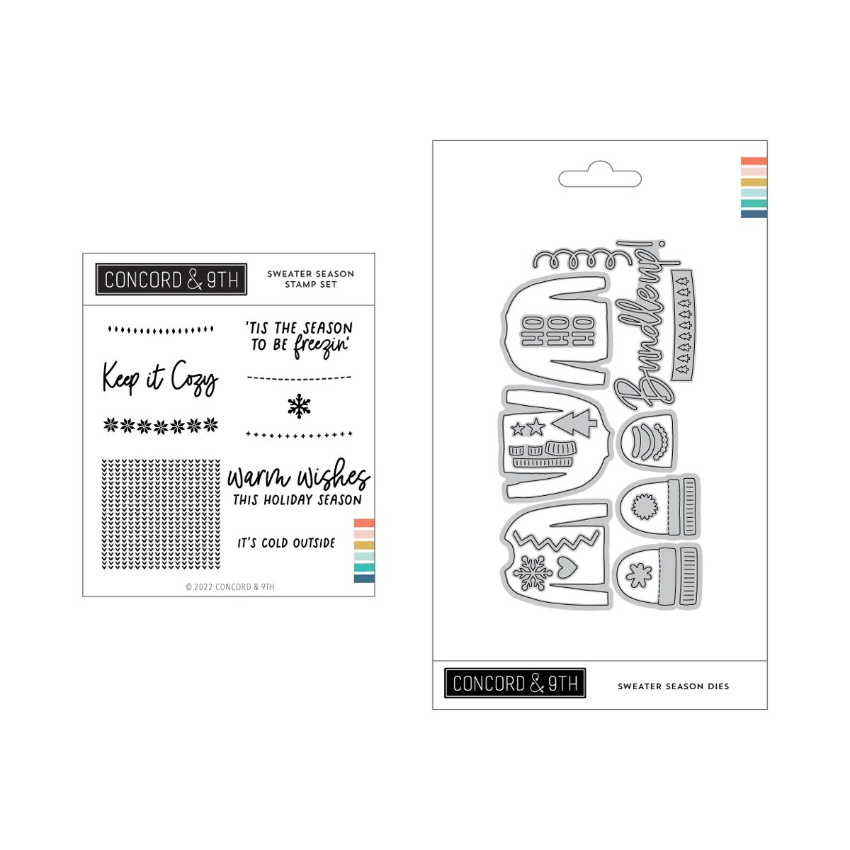
I decided that this color scheme would be perfect for a trio of sweaters on my card front, and I loved creating with Concord & 9th products to bring this card together. In the video, I also share this formula for one of my go-to card designs when I am not feeling inspired. Be sure to watch to learn it and try it for yourself!

Thanks so much for watching! You can find all of the products that I used to create this card below! I’d love to know—what would you create with this color scheme and will you try out my go-to card design? Leave a comment here!


Join Meghann as she creates mini shaker Valentines in a rainbow of fun, conversation hearts!
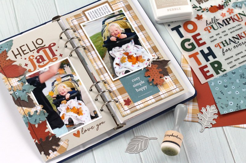
Read MoreHello, friends! I’m so glad you joined me today! I just had a new project to share over at the Scrapbook & Cards Today blog, and I wanted to share it with you here, too! Fall is my favorite season, and I am in love with this new, seasonal traveler’s notebook spread that I created with the latest Scrapbook.com exclusive products. Take a look!
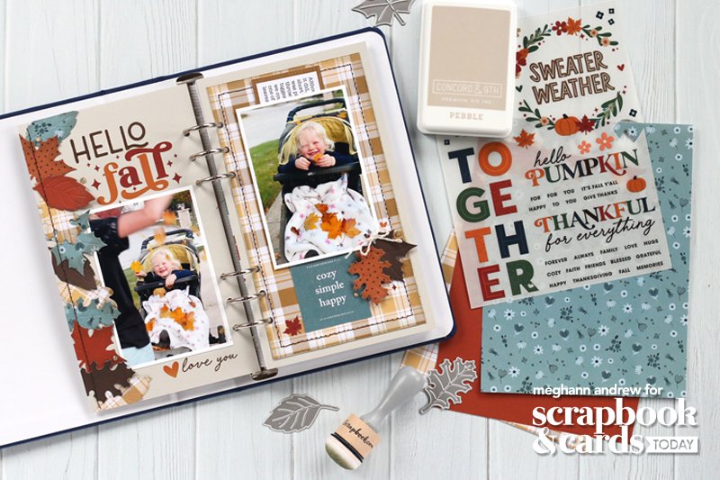
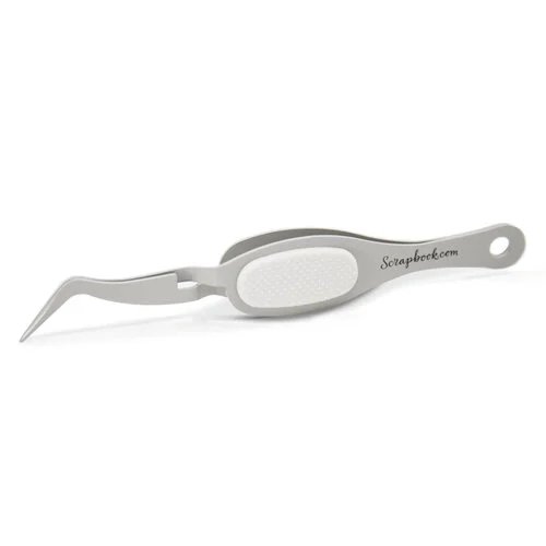
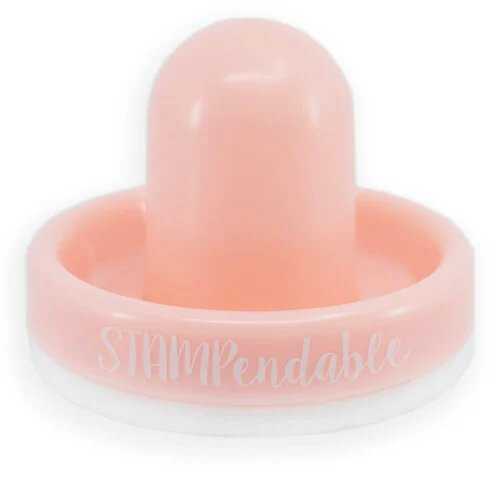
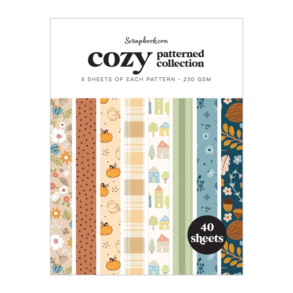
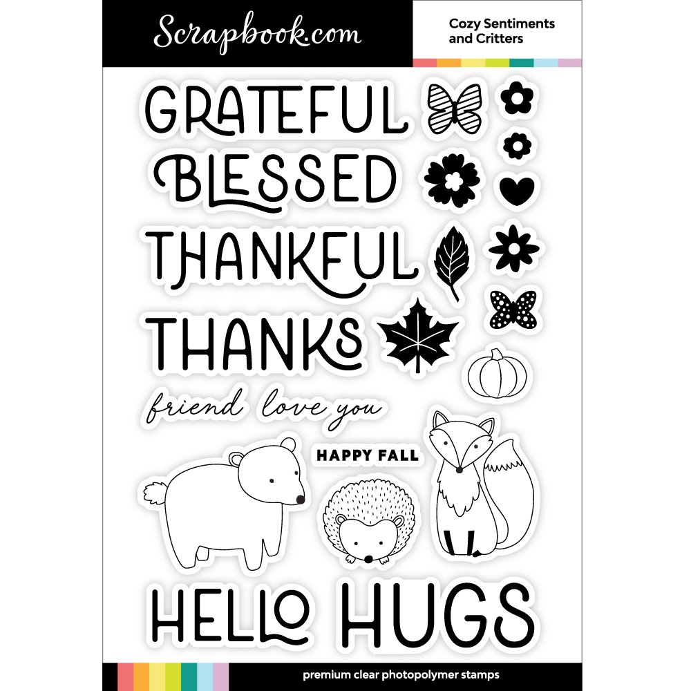
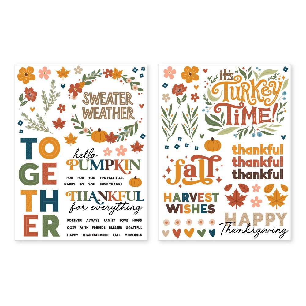
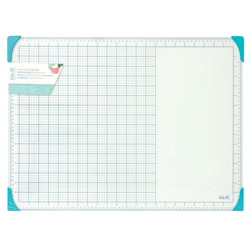
Supplies | Scrapbook.com: Cozy patterned paper 6×8 pad, Cozy Autumn Foliage shape dies, Cozy Autumn Sentiments & Critters stamp, Cozy Autumn rub-on transfers, Rose Quartz Misti, Magic Mat, ink blending tool, Deluxe adhesive roller, Mint tape – 1-inch roll, small precision scissors; Concord & 9th: Ink (Pebble, Nutmeg), Pebble cardstock; LDRS Creative: Rose Quartz Stampendable tool; Spellbinders: Platinum 6 die-cutting machine; American Crafts: Bungalow Lane embellishment die-cuts; WeR Makers: glass mat; Citrus Twist Kits: traveler’s notebook; Font: American Typewriter; Other: sewing machine, thread
This layout was so fun to create, not to mention easy, using the new, exclusive products from Scrapbook.com. From patterned paper to must-have rub-ons, these products made this spread come together in no time!
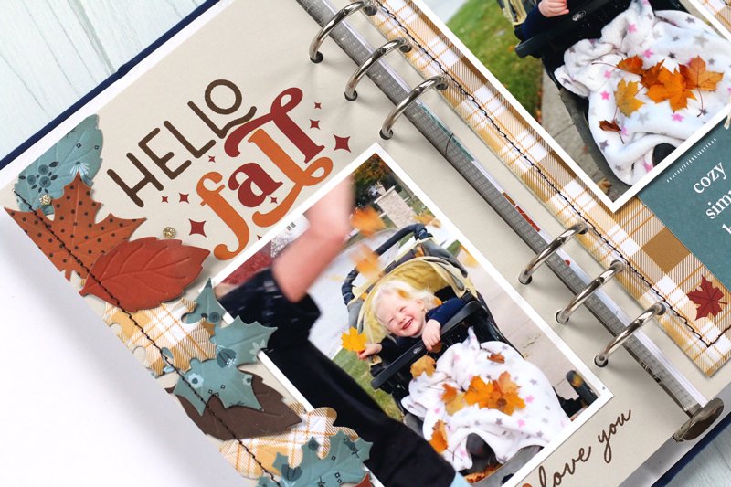
The left side of my spread is full of texture & interest with the column of leaves on the edge, created using the Cozy patterned paper 6×8 pad and Cozy Autumn Foliage shape dies. I loved the beautiful patterns and colors in the paper pad, which even includes solids! I also loved the special touch that the dies deboss the veins on the leaves and cut them at the same time!
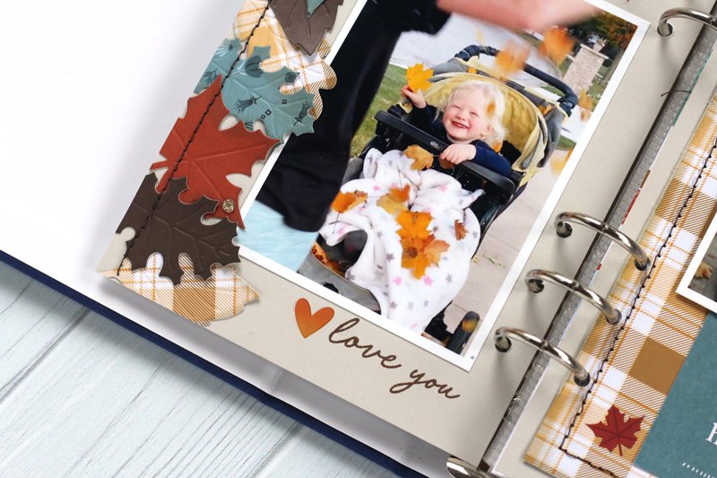
The Cozy Autumn Sentiments & Critters stamp helped me create my title with the “hello” word and this sweet “love you” below. To finish my title, I paired this stamp with the Cozy Autumn rub-on transfers to add the sparkly “fall” word and a few small leaves and hearts around the spread.
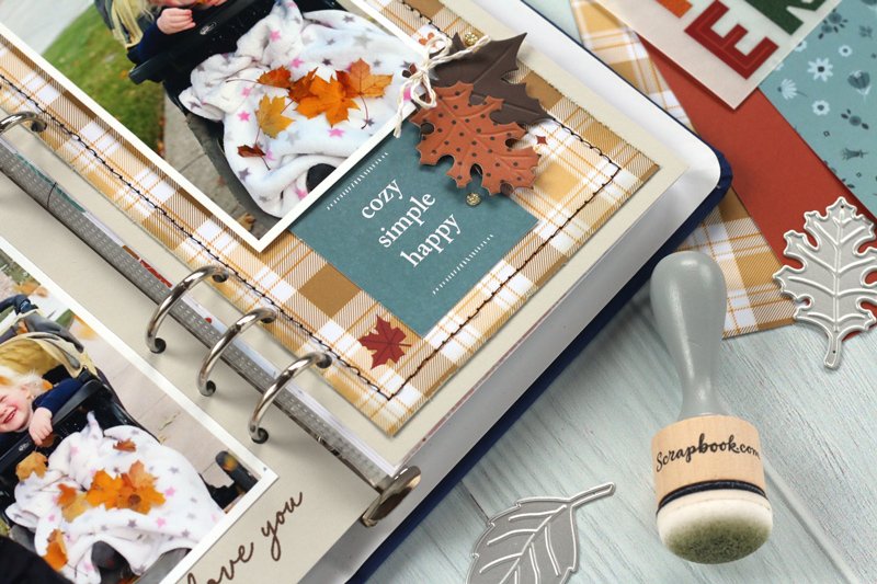
On the right side of the spread, I had to use the beautiful plaid pattern from the Cozy patterned paper 6×8 pad, adding stitching around the edge for texture. I added two die cut leaves to the corner of my photo and was so happy to use two pieces from the American Crafts Bungalow Lane embellishment pack, which coordinated beautifully with the Scrapbook.com products. It feels great to use something from my stash at the same time as creating with new products!
Ready to see more of this project? Watch my process video, featured on the Scrapbook & Cards Today YouTube channel below!
I hope you enjoyed seeing this project come together as much as I did creating it! Be sure to follow me on Instagram so that you can see more projects using Scrapbook.com exclusives, and be sure to shop what I used to create this project at the affiliate links below and above in my supply list. Thanks so much for your support, and happy creating this fall!


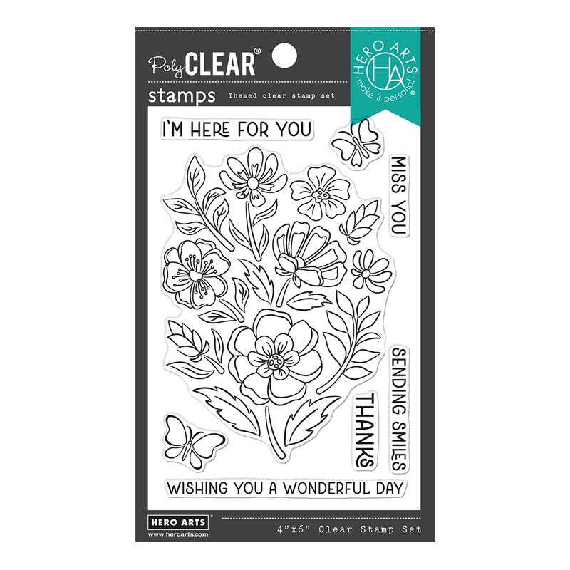
Happy Wednesday! Recently, I took a trip to my local paper crafting store, One Paper Place, and I grabbed a new-to-me stamp and die set with a coordinating stencil set from Hero Arts! Take a look at what I had to have:
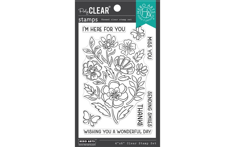
This set can be used in so many ways, but I first wanted to focus on the easiest method—using the stamped image as one large design on a card front. I chose two simple color ways to create this card duo:
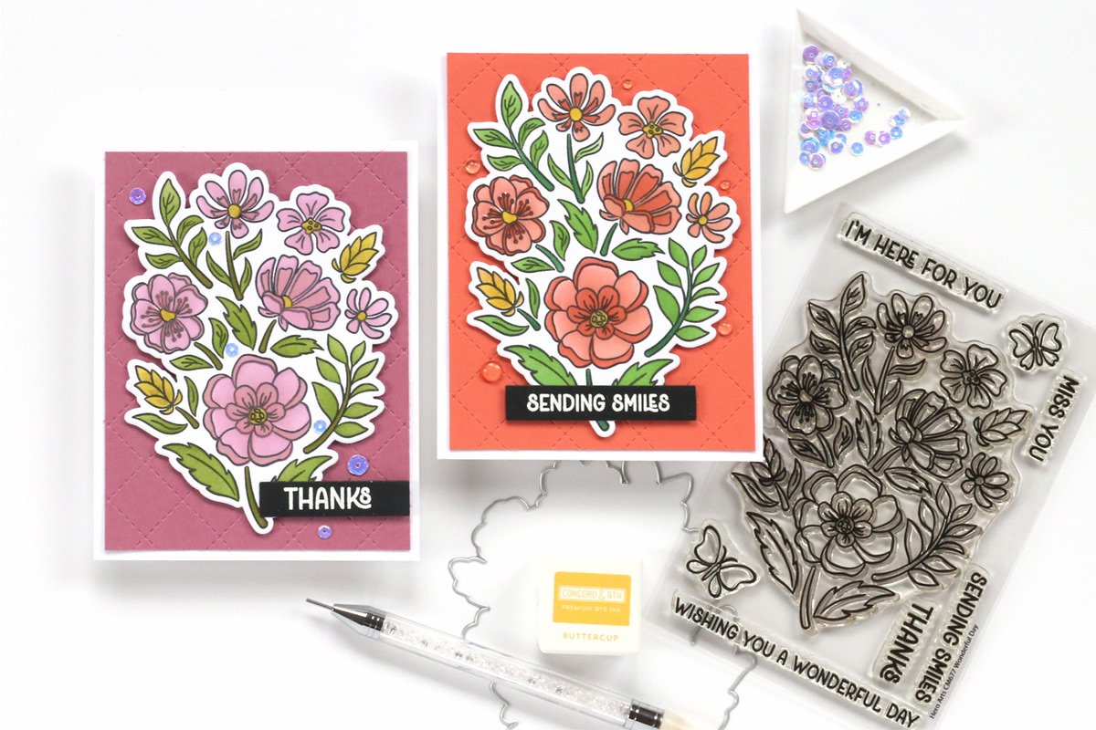
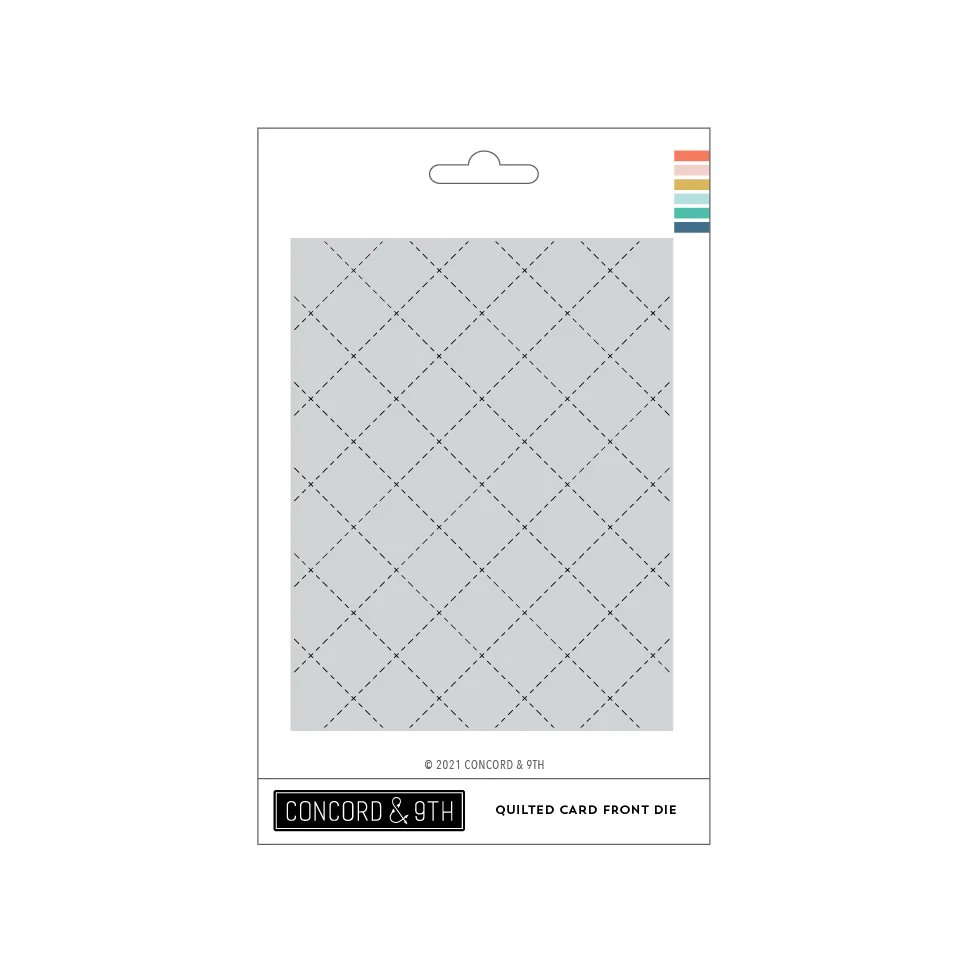
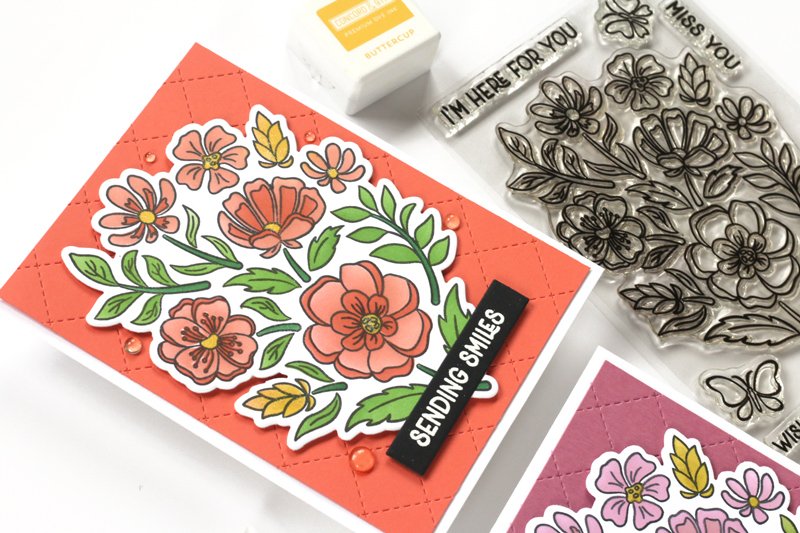
Supplies | Stamp & die bundle: Hero Arts Wonderful Day Bundle; Stencil: Hero Arts Color Layering Wonderful Day stencils; Background die: Concord & 9th Quilted Card Front die; Sentiment dies: LDRS Creative Sentiment Stack shadow die; Inks: Concord & 9th Grapefruit, Sorbet, Buttercup, Parsley, Evergreen, Carnation, Briar Rose, Honeycomb, Avocado, Artichoke; Cardstock: SCT Magazine exclusive 80 lb white, Concord & 9th Sorbet, Briar Rose, Black; Adhesive: Scrapbook.com deluxe adhesive roller, Scrapbook Adhesives by 3L crafty foam tape; Embossing powder: WOW! opaque bright white; Tools: Scrapbook.com Magic Mat; Spellbinders Platinum 6 die cutting machine; Taylored Expressions exclusive Misti stamping platform
This Hero Arts Wonderful Day bundle with color layering stencils holds so many creative possibilities! For this card duo, I chose the easiest method, using the stamped design as one image and choosing a limited color scheme to color it in with the coordinating stencil.
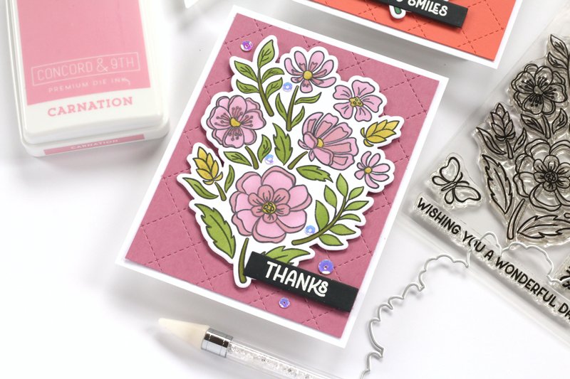
For my first card, I went with a warm color scheme, using some of my favorite Concord & 9th inks: Grapefruit, Sorbet, Buttercup, Parsley, and Evergreen. On my second card, I chose a few of their newest hues: Carnation, Briar Rose, Honeycomb, Avocado, and Artichoke. You could get even more variation by masking off individual flowers to create a multi-color design.
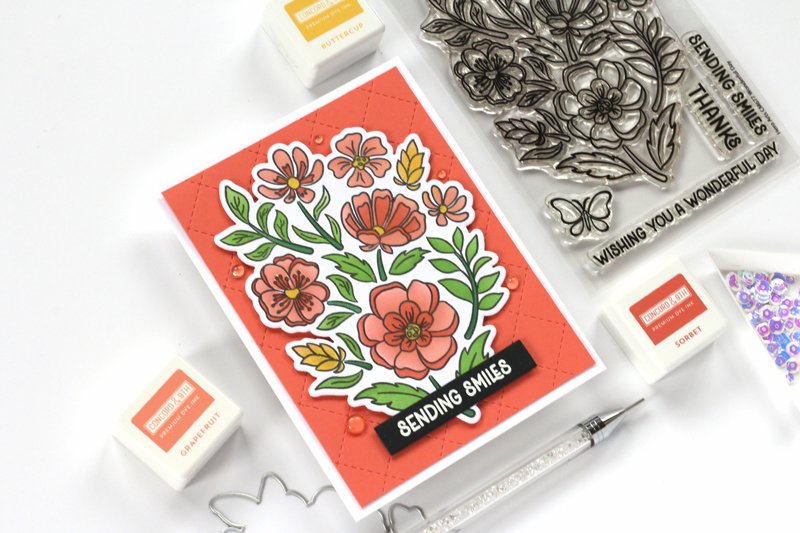
I placed the pretty floral panels on pieces of Concord & 9th cardstock in Sorbet and Briar Rose, which I die cut using the Concord & 9th Quilted Card Front die. This die created the perfect amount of texture on the background. To finish off my cards, I heat embossed the sentiments from the Wonderful Day bundle in white on black cardstock, then cut them out using the LDRS Creative Sentiment Stack shadow die. Only a few simple sequins and clear dots were added to complete the designs.
I am so looking forward to creating more cards with this set—especially with the individual flower dies included in the bundle! Stay tuned for more card examples using these products! Do you love coordinating stamps, stencils and dies as much as I do?


Hey there, friends! Two weekends ago, I had the pleasure of teaching at Crop & Create Moncton with a lovely group of friends for my FIRST in-person card class!

I was definitely nervous, but this lovely group of ladies put me at ease as I shared my tips and tricks for ink blending, and we created three beautiful cards! Take a look!
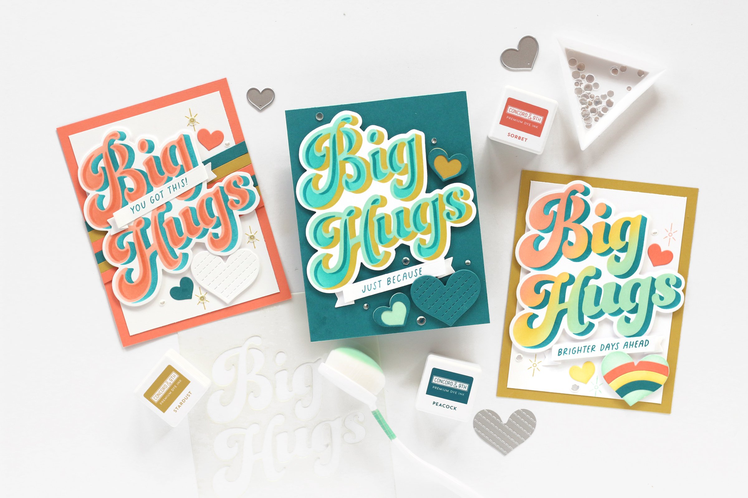
The Concord & 9th Sending Hugs stencils are SO easy to use to create BIG, bold sentiments, in your favorite colorway! In this class, we created three different sentiments, making the ink-blending process the focus of the class.

We started out with this beauty, featuring some of my favorite Concord & 9th hues: Grapefruit, Sorbet and Peacock! Did you ever guess that this combination could be so striking together? Gotta love contrasting colors! To add a bit of something extra, we backed the big sentiment, cut using the Sending Hugs dies with cardstock strips. I love the possibilities that 1/4” strips add to your cards. Another sentiment in the center and a few hearts finished off the card beautifully.
Fun fact: Myself, along with help from the SCT Crop & Create team of Virginia Nebel and Jess Forster, cut all 40 bundles of white die-cuts for the class so that they could focus on their blending instead of die cutting. Dream team!

On our second card, I took full advantage of my love for all things teal! I used Sea Glass, Peacock and Stardust to create the big sentiment, and even showed the class how to ink-blend their white die cuts if they don’t have the same color of cardstock on hand. It’s a great tip for any cardmaker!
I also taught the class the joy of double die-cutting, or cutting the center out from your die-cut shape. On this card, we cut the smaller heart out of the center of the medium heart to fill it with a different color.

Our final card was by far my favorite, and I showed the class the beauty of blending multiple colors in one single stencil to create this rainbow sentiment using Grapefruit, Stardust and Sea Glass inks, shadowed with Peacock ink. We also did a bit more blending on our die cuts since we didn’t have yellow cardstock. How perfect did that rainbow heart turn out? This just shows the amazing possibilities using blending techniques!
As much fun as I had teaching this class, the best part was by far having the attendees come up to me afterward to show me their finished designs and tell me how much they learned. That is what teaching is all about to me, and I can’t wait to do it in-person again! Who’s with me?


Hey there, friends! It has been a while since I have stopped by this space of mine, and I think it is about time that we become reacquainted! I have missed blogging, and want to make it a goal to add updates here regularly in 2023.
Today I want to talk to you about being published! I know that as papercrafters, this is often a goal. I’m here to tell you that your goal is attainable and give you some tips for checking off that bucket-list item!
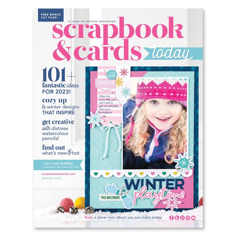
I was so fortunate to be published on the cover of the Scrapbook & Cards Today Winter 2022 issue! If you haven’t yet checked out this publication, I highly recommend you do, and it’s FREE!
When I was assigned the task to create a cover layout, did I run out and purchase the latest collections to work with? Nope. I looked around my stash and grabbed what I had on hand. What makes a pub-worthy project? Good design! Let me break that down for you:

Color matters: When I begin my layout, 95% of the time I choose a color scheme that ties into my photo. This will make your photo POP and helps it to become the focus of the page. On this layout, I chose the darkest color, navy, to frame my page, then filled in the background with the accent colors from the photo, pink and teal.
Think contrast! Bold designs are what will draw your eye to the project on the pages of a magazine, so think about how you can use contrasting colors, shapes, textures, patterns and fonts.

Titles are terrific! Layout titles are a great way to add contrast and interest and make your layout stand out. Use only 2-3 different fonts and colors and choose contrasting fonts like I did here!

Don’t go overboard with embellishment. A clean design is often best on a magazine page, so when choosing your embellishment, select wisely. Be sure to think about contrast in shape and texture, and always take off one item before you call it done. Just like Coco Chanel said, “Before you leave the house, look in the mirror and take one thing off.” Do the same with your layouts!

Use lines. Last, but certainly not least, think about how lines play a role into how you look at your layout. Borders, frames and other implied lines created by embellishment or the way you cut patterned paper can all create interest and draw your eye to the photo on your page. Use lines to your advantage!
I hope you’ll use these tips when creating for a magazine submission, and great news: the Scrapbook & Cards Today Summer issue call is now available!
Hello friends, and happy Friday! I recently had the pleasure of creating with the Echo Park Paper Remember the Magic collection for the winter 2020 issue of Scrapbook & Cards Today Magazine! Because Disneyland is just about my favorite place to be, this layout came pretty easily to me, using this very themed, beautiful collection to document Christmas Disney moments:
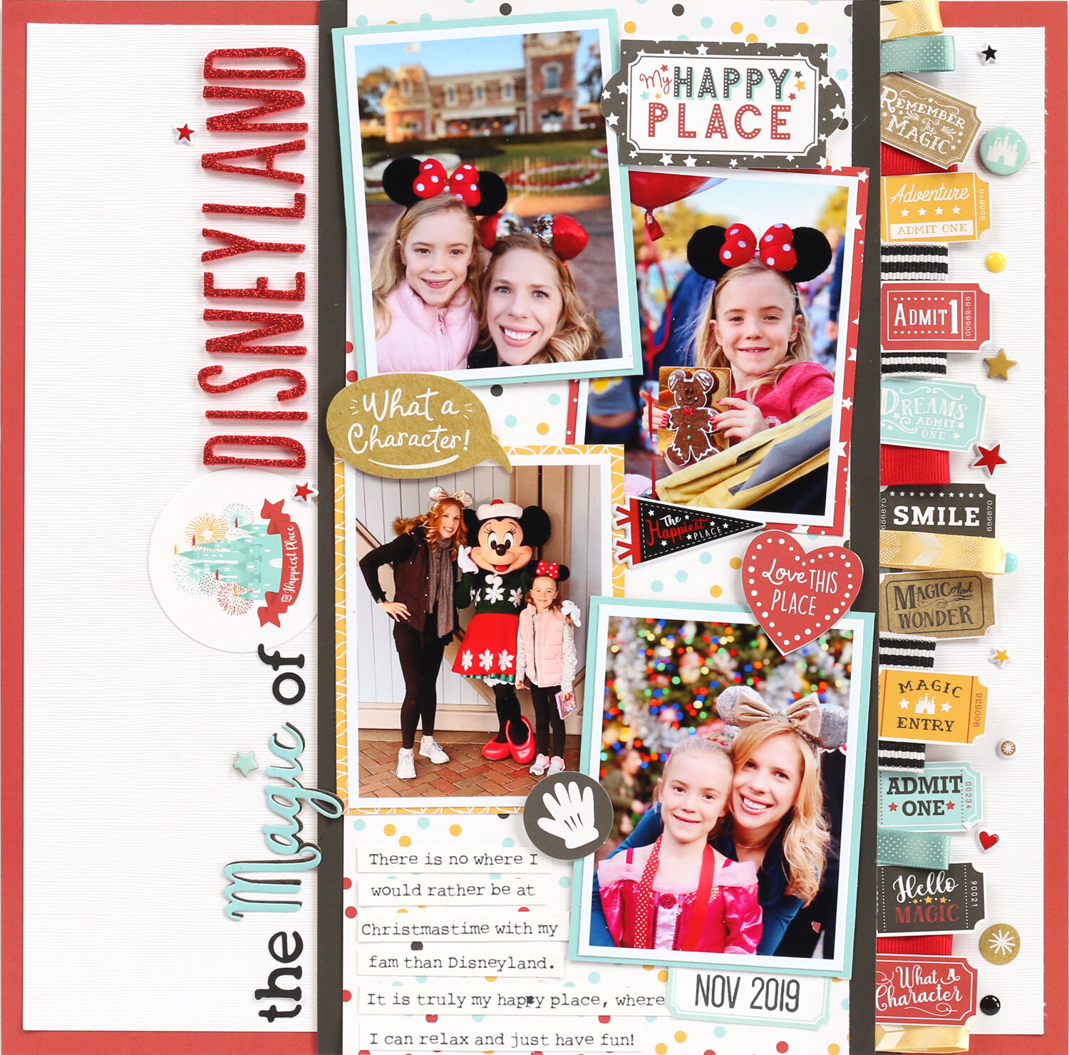
One thing I love about this collection? The addition of kraft as a neutral with the characteristic red, black, robin’s egg blue and golden yellow hues. The one piece of paper that made this layout “click” for me was this one:
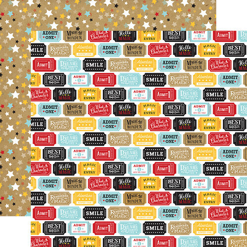
This Tickets Please paper was just calling to be fussy-cut, and I created a fun column of tickets and ribbon from my stash (because who doesn’t love a good stash-bust!?) on the right side of my layout.
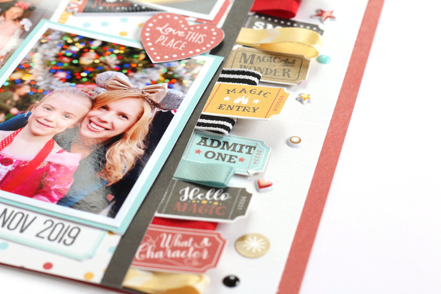
Lots of dimension and texture right there! I love everything about this layout—from the vertical design, to the images I chose, and the title I created from a mix of the Remember the Magic dies and stickers from Elle’s Studio and American Crafts.
FIND THIS LAYOUT IN THE WINTER ISSUE OF SCT MAGAZINE ON PAGE 43 AND 47!
Once I created the page, I put this collection away, expecting to create another Disney layout with it.
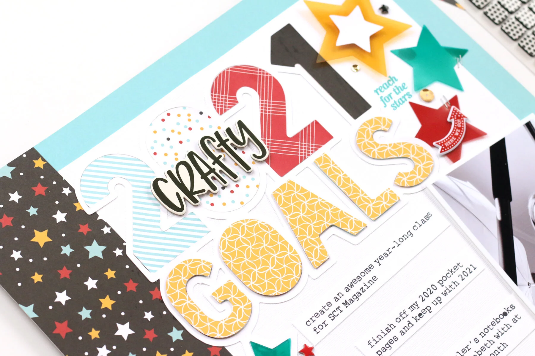
Then, I started thinking… why can’t I use this collection for something other than Disney memories? So, I challenged myself to do just that, on my first layout of 2021, created for the Scrapbook & Cards Today blog:

Does this layout scream, “Disney!” to you? Nope! How did I take such a themed collection and stretch my stash to create a non-themed layout? Here are 3 simple tips on how to do it:
1: “Neutral” patterns & “B” side bonanza:
I was inspired by Paige Evan’s cut file (download for free at the SCT blog post!) to add a lot of stars to my page, and although the Wish Upon A Star paper shown on the left of my page may have included the Disney-friendly hues from the collection, once you took the Disney photos away, no one could tell the difference! I call this a “neutral” pattern. It can be used for anything, and you often find these in themed collections, too. This paper was the starting point for my color scheme, based on the collection. You can also see that I used patterned paper to fill in my “2021 Goals” die cut. All of these patterns are on the B-side of the paper, often the less-noticed, more low-key prints. Stripes, dots, plaids and geometrics are my preferred patterns, and they worked perfectly at the top of my page.

2. Embellish Away the Theme!
Sure, this Remember the Magic collection has plenty of castles, big white gloves, and churros (mmmm…) in it, but I chose to ignore them. Instead, I searched the collections chipboard and sticker sheets for non-themed embellishments, like the “here we go” puffy arrow, “dreams admit one” puffy ticket and chipboard camera. Plus, there were plenty of chipboard stars to accent these larger embellishments. Every themed collection will have VERY themed embellishments, but ignore those and go for the ones that fit your page. The “dreams admit one” ticket was very notable on this layout about my goals for 2021, and the “here we go” arrow was perfect for documenting this at the very beginning of the year.
3. Mix and Match to Success!
Once I had the elements chosen from Remember the Magic, I shopped my stash for products from other manufacturers that would fit the design, hues and the story I wanted to tell. I grabbed that “crafty” chipboard piece from the Simple Stories Crafty Girl collection, as well as the amazing acetate stars from Elle’s Studio, which fit with the color scheme and the starry page I was going for! To finish off the page, I used the My Star Stamp from Elle’s Studio to add uplifting phrases around my embellishments. Starting with a themed collection to create a non-themed layout doesn’t mean you have to stick to those products only! Branch out and see what other items you may have on hand that would accent it!
I hope these tips have given you some thought as to how to bust your stash of themed collections for non-themed layouts! If you’re a Disney fanatic like me, be sure to check out the beautiful Remember the Magic collection for yourself, but don’t just use it for Disney layouts! Happy creating, friends, and have a beautiful weekend!
Hello, friends, and happy December! I can’t believe we are already in the final month of the year! Christmas has come a bit early, because today I have the brand new December 2020 kit and add-ons from Elle’s Studio to share with you! First up, let’s take a look at all of the new goodies in my December 2020 unboxing video:
How wonderful are these new products? First up, the December kit contains so many different color options. With its festive tags and winter themes, it’s one that will have you documenting into the new year!

But don’t forget about the add-ons. There are a few that have me seeing stars, like the Stitched Star wood veneers, My Star stamp and My Star metal die that I know will be popular, so if you love them too, don’t delay in grabbing them from the shop!
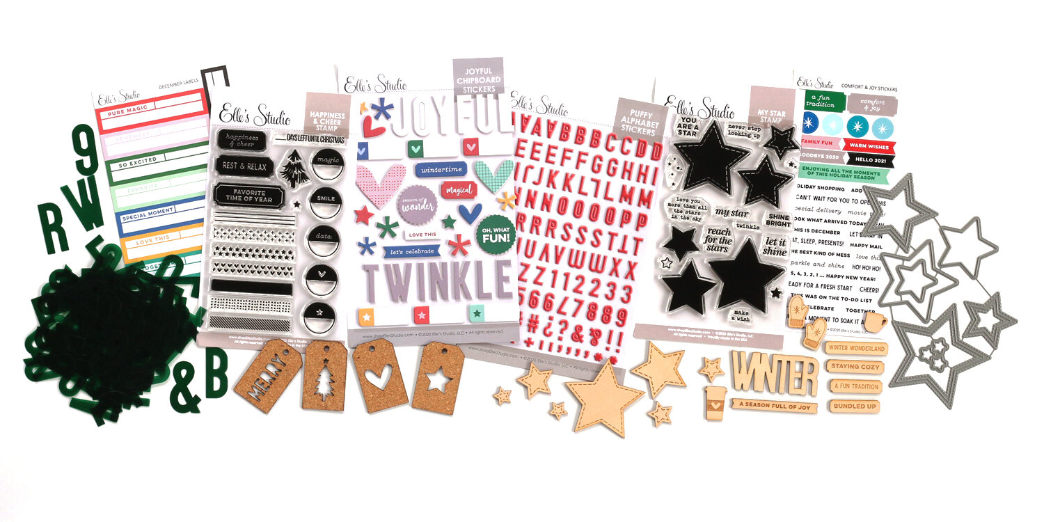
This month, I decided to focus on the “2020 favorites” and “pause and reflect 2020” tags to record the memorable moments of our year in a 12” x 12” pocket page. I just love the blue, yellow, black and gray colour scheme that I pulled out of the kit contents.
You can see this page come together, and how I created two shaker pockets for it in my process video:
I hope you love these new Elle’s Studio December 2020 goodies as much as I do! Be sure to shop the products that I used to create my pocket page at the gallery below, and get your 2020 wrapped up in a beautiful way in your album! Thanks so much for stopping by and happy creating, friends!
Hello friends! Today I’m here to share a new project with you, one that is especially dear to me. This year has been rough for our family—moving and having a new little one during a pandemic has made us all look at life differently. To counter what is going on in the world around us, we try to add a dose of happiness into our lives every day, with walks, music and our favorite foods. I decided that I also needed a dose of that happiness in my crafty space, and today I’m sharing how I did that with the new Heidi Swapp Blush Memorydex Spinner*, only available at Scrapbook.com!

I’ve always loved the idea of “happy thoughts,” like in Peter Pan, the thoughts and memories that make you fly. Well, this project pulls at my heart strings, and each new Memorydex card that I create for the spinner will showcase the most special people and moments that make me happy.

I created my cards by cutting patterned paper using the Memorydex die set. On this title card, I used the Title Builder Vol. 3 stamp to add the words “my” and “thoughts,” and embellished with Heidi Swapp’s beautiful Storyline Chapters collection and the gold Thickers from the Avenue collection by Pebbles, Inc. I love the look of layered paper, labels, tags, vellum and washi tape on this card.
None of these cards are meant to be complicated: a simple mixture of patterned paper, die cuts, tags and a bit of gold thrown in highlights the photos, which are the most important part of this project.

If I choose to add journaling, I’m leaving the back of each card blank. Here I could add my thoughts, the details of the memory, or the date.

What I especially love about this project is that it is timeless. I can add a memory that makes me happy from ten years ago, or just yesterday. It’s all about how each moment makes me feel.

So, when the things going on in the world around me get me down, my plan is to just flip through this Memorydex that stores all of my happy thoughts, the ones that make my heart fly. I can’t wait to share more of my cards with you.
Find all of the products that I used in my Memorydex project below in the shoppable gallery, and consider starting a “happy thoughts” project of your own, or gifting this beautiful Memorydex to someone you care about this Christmas!
* Affiliate links used at no extra cost to you! Clicking to shop helps me pay for this blog and video feed. Thanks so much for your support!
Hello, friends! I have a confession for you… I am not a shopper. I don’t like to buy new products that much, and would rather use what I have on hand. I’m more of a less-is-more kind of gal. I love the look of foiled projects, but have resisted the urge to spend a lot of money on a foiling machine, so I thought that I would never be able to create foiled designs.
That all changed this week when my friends at Therm O Web sent me their new Fairytale Foils and Transfer Gel Duo* to play with, and I was able to try out this new-to-me technique. Let me just say, I am in LOVE!

I had some baby-free time one evening to experiment with the Therm O Web Transfer Gel Duo, Fairytale Foils and the Vicki Boutin Let’s Wander Starstruck stencils from my stash. The results were amazing!

This technique is simple and easy! Using a stencil and my new Therm O Web Stencil Pal, I applied a thin coat of the Transfer Gel Duo to the stencil. *Note: If the coat of Transfer Gel is too thick, it will increase drying time, and you won’t have crisp, clean results when you foil. You can see the difference in my video below!

After the gel had dried overnight,, I applied the foils to the design, ran the card front through my Revolution die cutting machine, and VOILA! I had an amazing, foiled card background! No special printer, or expensive foiling machine required. I’d love to show you how I did it in this process video:
I’m not much of a mixed-media technique gal, but I am now a foiler! I can’t wait to try out the Deco Foil adhesive pen next. Oh the possibilities! I hope you’ll give these products a try, too. I promise you won’t be disappointed with the results!

Be sure to check out all of the products I used in my video, either in the video notes or in the shoppable gallery below. Thanks for stopping by today and happy creating, and FOILING friends!
* Affiliate links used at no extra cost to you! Clicking to shop helps me pay for this blog and video feed. Thanks so much for your support!
Hello friends! I am so excited to introduce you to the September 2020 kit and add-ons* from Elle’s Studio today! First, let’s take a look at all of the new goodies in my unboxing video:
Beautiful, deeper hues, with grateful and family-oriented prompts in the September monthly kit bring autumn to your projects in a gorgeous way!

Take a look at the add-on embellishments that coordinate with the kit, too!

These beautiful products are perfect to kick off the transition into cooler temps, warmer clothes, comfort food and more. You'll love the rich color scheme found in the kit and the amazing add-ons, which range from a new paper stack to jewel-toned puffy rainbow stickers!
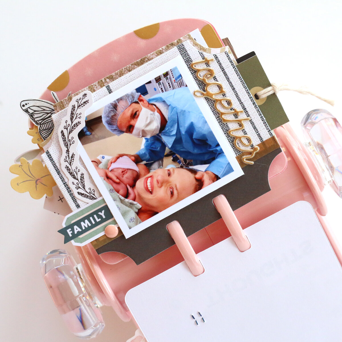
This month, I used these stunning new products to create a layout that is dear to my heart, recording the day that we brought my son home from the hospital.

I loved using the My Heart metal die to create a bunch of floating heart "balloons" on the right side of my layout. Watch my process video as I record a truly special memory while creating my first layout after having my second child. I hope it inspires you to document a memory that is near and dear to your heart, too!
Be sure to follow me on Instagram to see what else I create with the September kit and add-ons this month! You can find all of the products that I used to create this layout at the shoppable gallery below, and happy creating with your new Elle’s Studio goodies!
Hello, friends! I am so excited today to introduce you to the Elle’s Studio July 2020 kit and extras! Let’s start off with my unboxing video so that you can see each new product released today!
I hope you’re as excited about these beautiful, new products as I am! The July 2020 kit is filled with gorgeous colors, fun icons and tons of opportunities for getting your stories in your album! Take a look!
Don’t forget about the add-ons that coordinate with the kit! We have not one, but two new puffy alphabet stickers, a new paper stack, chipboard stickers, labels, washi tape stickers, wood veneers AND an awesome new stamp set! Oh my goodness!

The digital files are pretty awesome this month, too! Did you know that if you’re a subscriber, you get them for free?? Yep! Just another perk of starting a subscription this month!

This month, I started off my projects with a layout that I created using the Wild at Heart printable and the new July products in a way that I love to use them—to create a layout background!
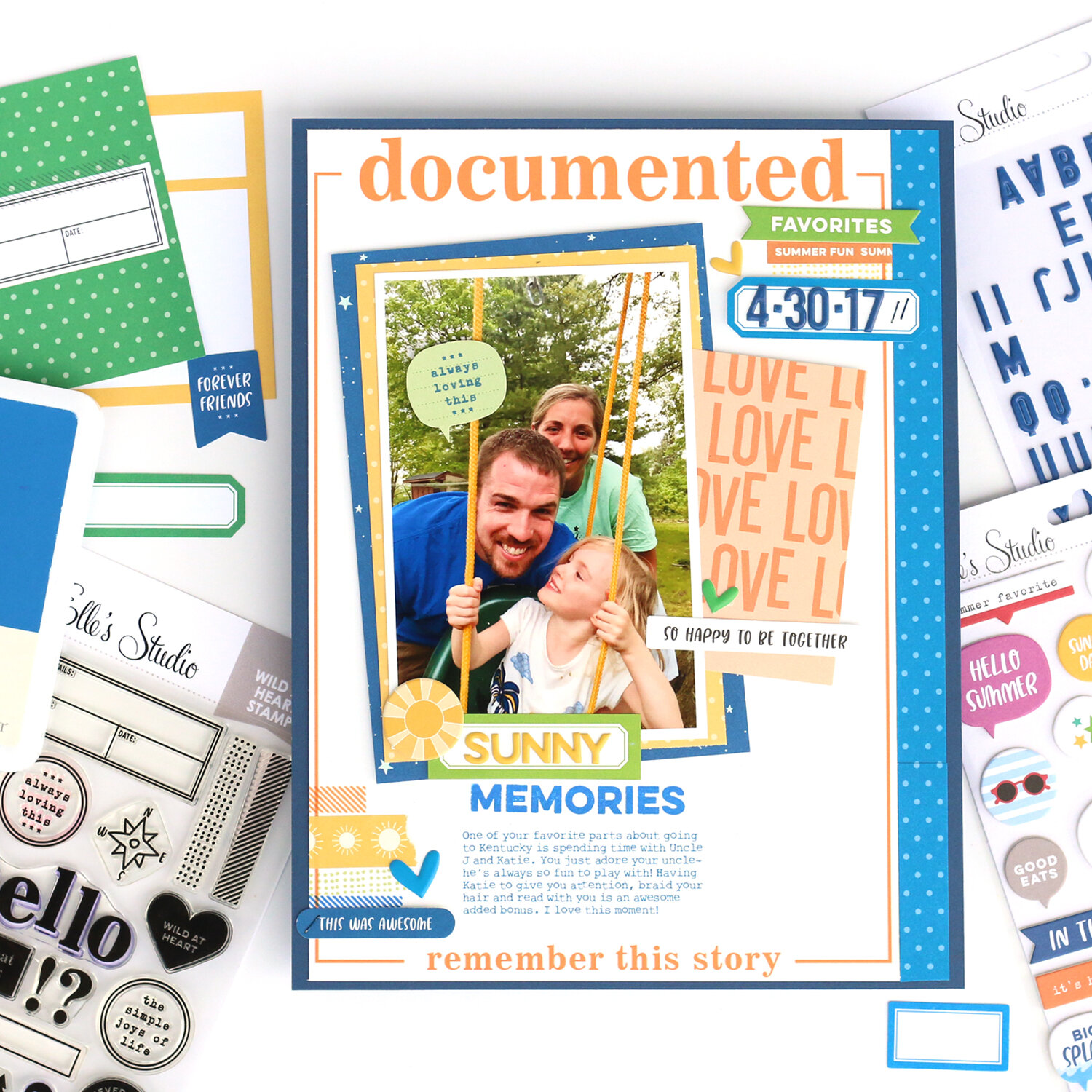
This photo was perfect for the blue, yellow, orange and lime green color scheme that I built on this layout from the new products. I loved adding the Summer tape stickers and brand new polka dot pattern to the background, and building that title with the Title Builder stamps! Take a look at how it all came together in my process video:
Be sure to grab all of the new July products while supplies last, and you can shop everything that I used to create this layout at the stoppable gallery below! Thanks so much for stopping by, and happy creating!
* Affiliate links used at no extra cost to you! Clicking to shop helps me pay for this blog and video feed. Thanks so much for your support!
Hello, friends! I’m so excited to be with you today to share the new June 2020 kit and add-ons* from Elle’s Studio! Let’s take a look at my unboxing video, where I will show you each of the new goodies:
It’s summer in a box, right? There are so many fun products on offer this month! Let’s take a look at the kit up close:
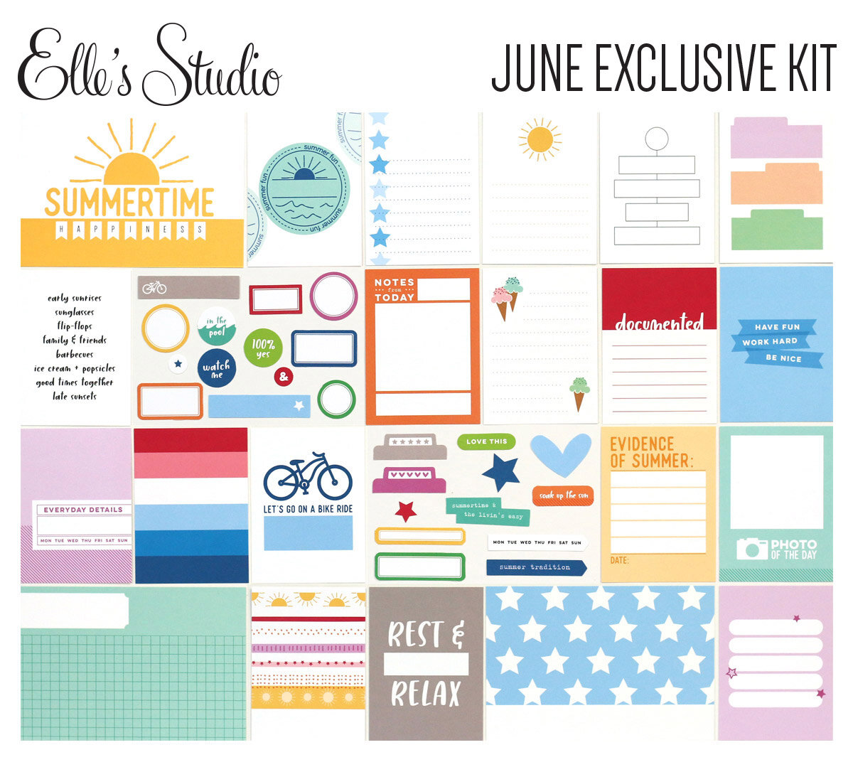
The beautiful combination of colors in the June 2020 kit will bring summer to your workspace, and your albums—no matter if you create a layout, pocket page, traveler’s notebook, mini album or greeting card!

If you thought the kit was fantastic, just take a look at the coordinating June add-ons! A new paper stack, colorful chipboard stars, puffy banner alphas… oh my! There are so many wonderful products available in the shop to inspire you to record your summer memories, past and present!

Don’t forget about the digitals! These handy Summer Snapshot printables, June 2020 cut files and print and cut labels can fill your library with colorful designs and useful elements to create any project. I had to use all of the gorgeous colors available in the new kit and extras, as well as the “happiness” digital die cut banner to create this fun layout about a sure sign of summer:

This layout just makes me so, incredibly happy, and records my daughter enjoying one of her favorite summer treats when we travel to the UK each summer to visit family: a 99 cone! This was her first cone of the summer of 2018, and I wanted to match her happiness in the photos with my layout design, so I chose to use all of the colors available in the June kit and extras.

My BIG title, created with the June 2020 cut files and Large Jane alphabet stamps was one of the first parts of the layouts that I designed, and brought that “celebratory feel” to the page. I love how it lays on top of the colorful striped patterned paper from the Summer Fun paper stack, too!

I also added three fun groupings of small embellishments, which included Chipboard Star Stickers, Ice Cream Stickers, die cuts from the June kit and tiny stamped stars from the Summer Fun stamp.
Want to see how this layout came together in real-time? Watch my process video below!
I hope you love these new Elle’s Studio goodies as much as I do, and if so, don’t wait to add them to your cart! These colorful products are sure to be a bit hit! You can find the products that I used to create my layout in the gallery below! Thanks so much for stopping by today, and happy creating with your new Elle’s Studio June 2020 kit and extras!
* Affiliate links used at no extra cost to you! Clicking to shop helps me pay for this blog and video feed. Thanks so much for your support!
A bit of pretty paper, food indulgences and a blessed life.
I'm Meghann Andrew, a wife, mother of two living in the Chicago suburbs, maker, and excess coffee drinker. Thanks for stopping by this space where I share a bit of my life and my creations.


A note from Meghann:
This is a for-profit blog. I use affiliate links for shops and products that I use, love and believe in on the sidebars and in posts, as well as on my other social media sites that are linked from here. If you purchase a product through an affiliate link, I receive a small commission, but you will pay no extra than if you had not clicked through my affiliate link. I receive product free of charge from manufacturers that I design for, which you can see above. All words and opinions expressed on this blog are my own.
All images copyright Meghann Andrew, unless otherwise noted. All rights reserved. Powered by Squarespace


